
Access powerful product analytics
Build reports and dashboards to track product KPIs and demonstrate progress against your roadmap
Build reports and dashboards to track product KPIs and demonstrate progress against your roadmap

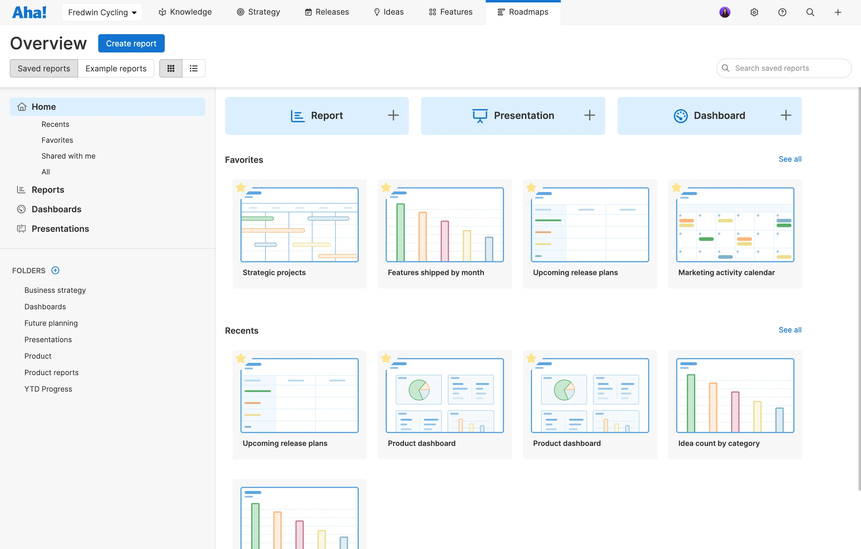
It has never been easier to build, save, and share the perfect report. Start by using one of our 75+ example reports. Or create a custom list report, pivot table, or chart with the data that is meaningful to you. Choose from more than 200 fields, add filters, and then customize the details to gain the insights you need super fast.
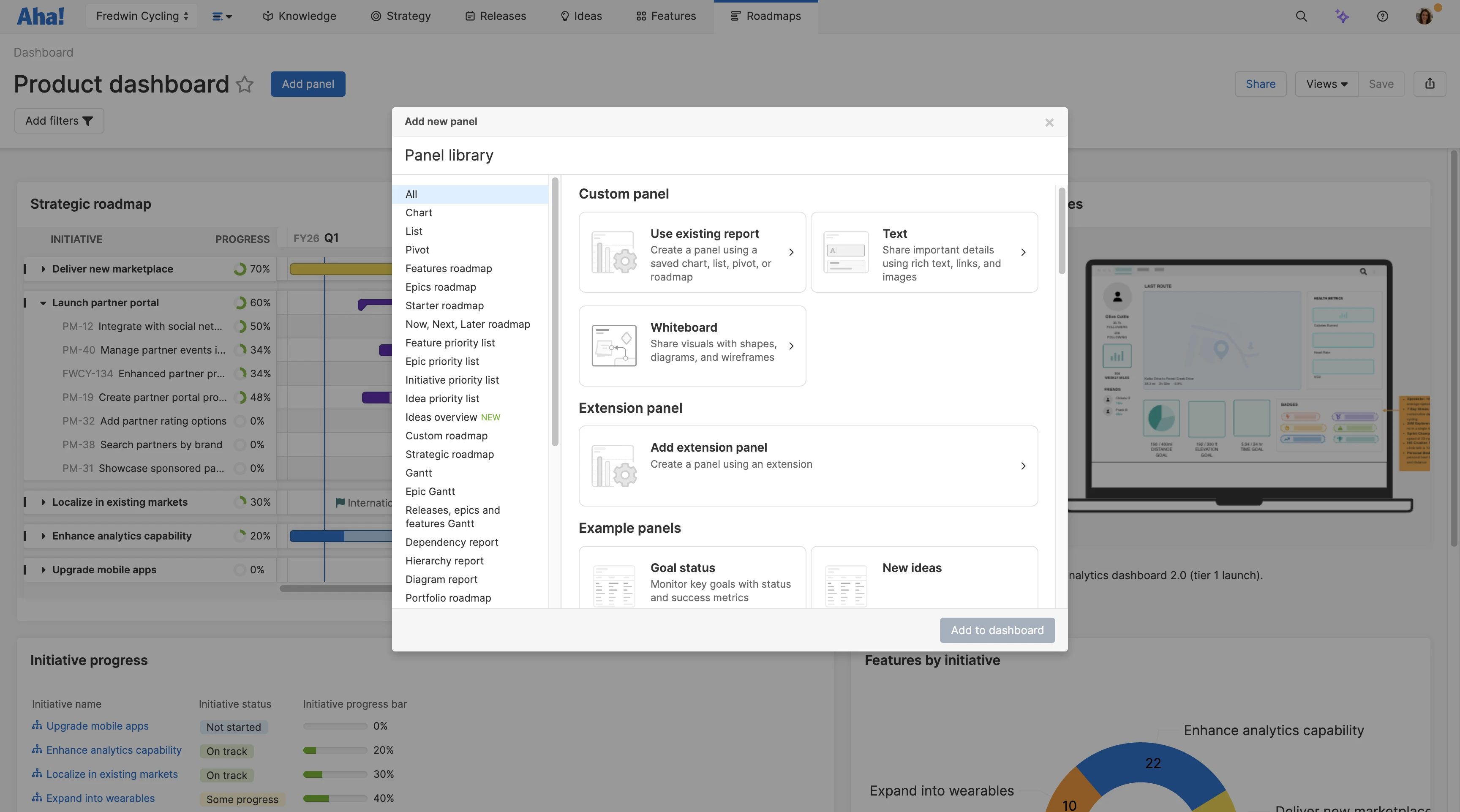
Display your plans, progress, and KPIs in a single view. Add any roadmap, report, or whiteboard to a dashboard and arrange the layout exactly the way you want. This gives you a complete look at your strategy and plans — so you can quickly evaluate how your products and projects are progressing.
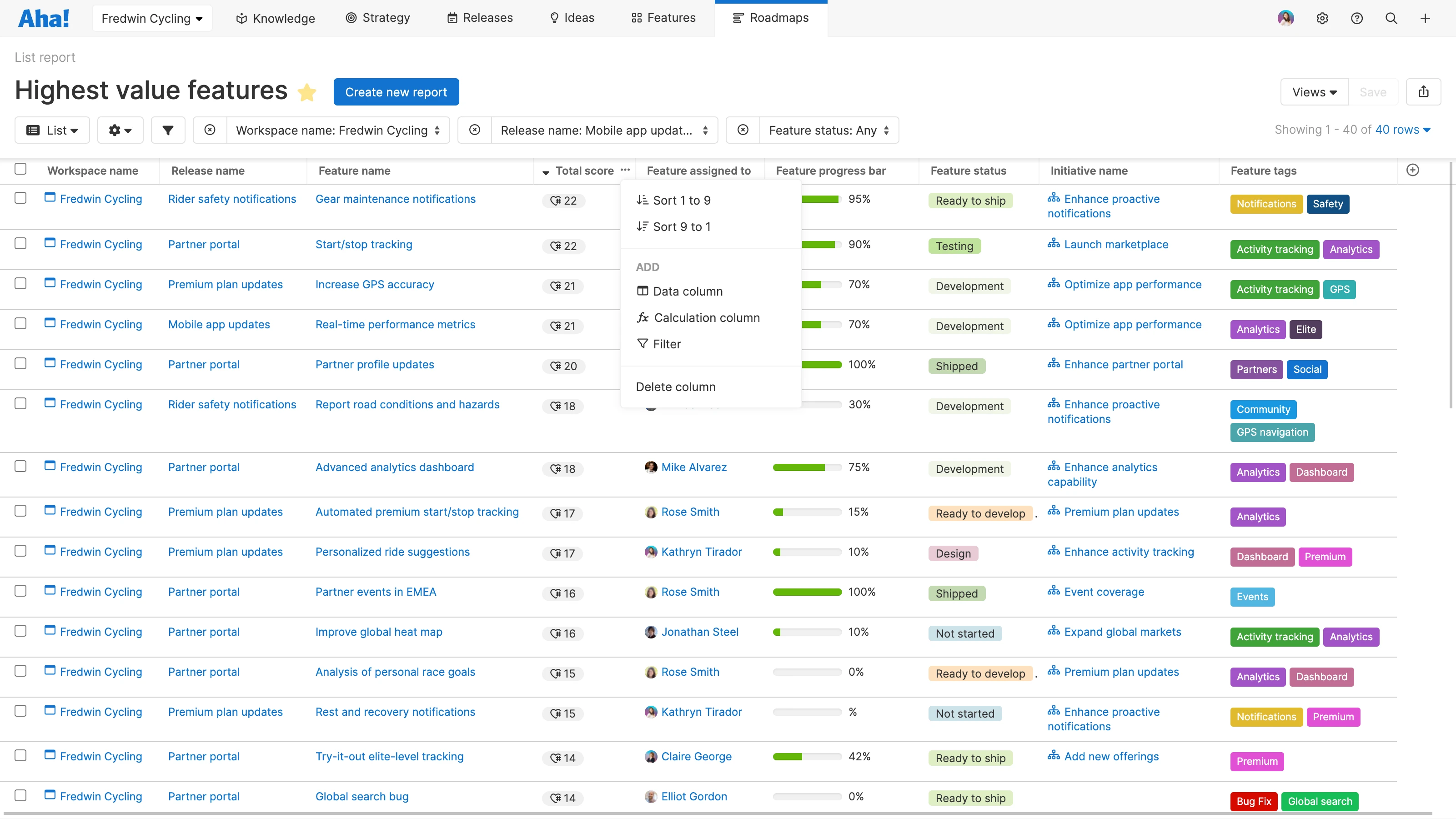
Compile your data in a list table that you can dynamically filter and sort. Include records from all of your workspaces and focus on the most relevant information. Add calculation columns to draw meaningful conclusions from your product data — or include history fields to track roadmap changes for audits and regulatory reporting.

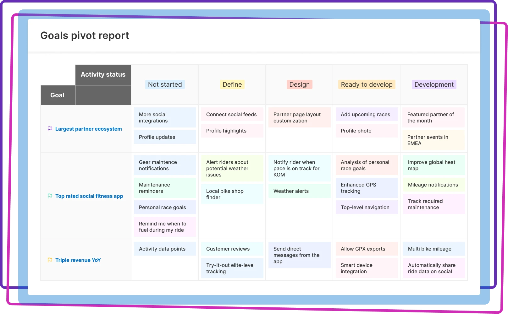
Pivot tables are ideal for analyzing large amounts of data. Control how you group, sort, and summarize fields to visualize your data in the most compelling way. Summarize data across rows and columns based on the total, average, minimum, or maximum value to quantify your analysis and drive changes.
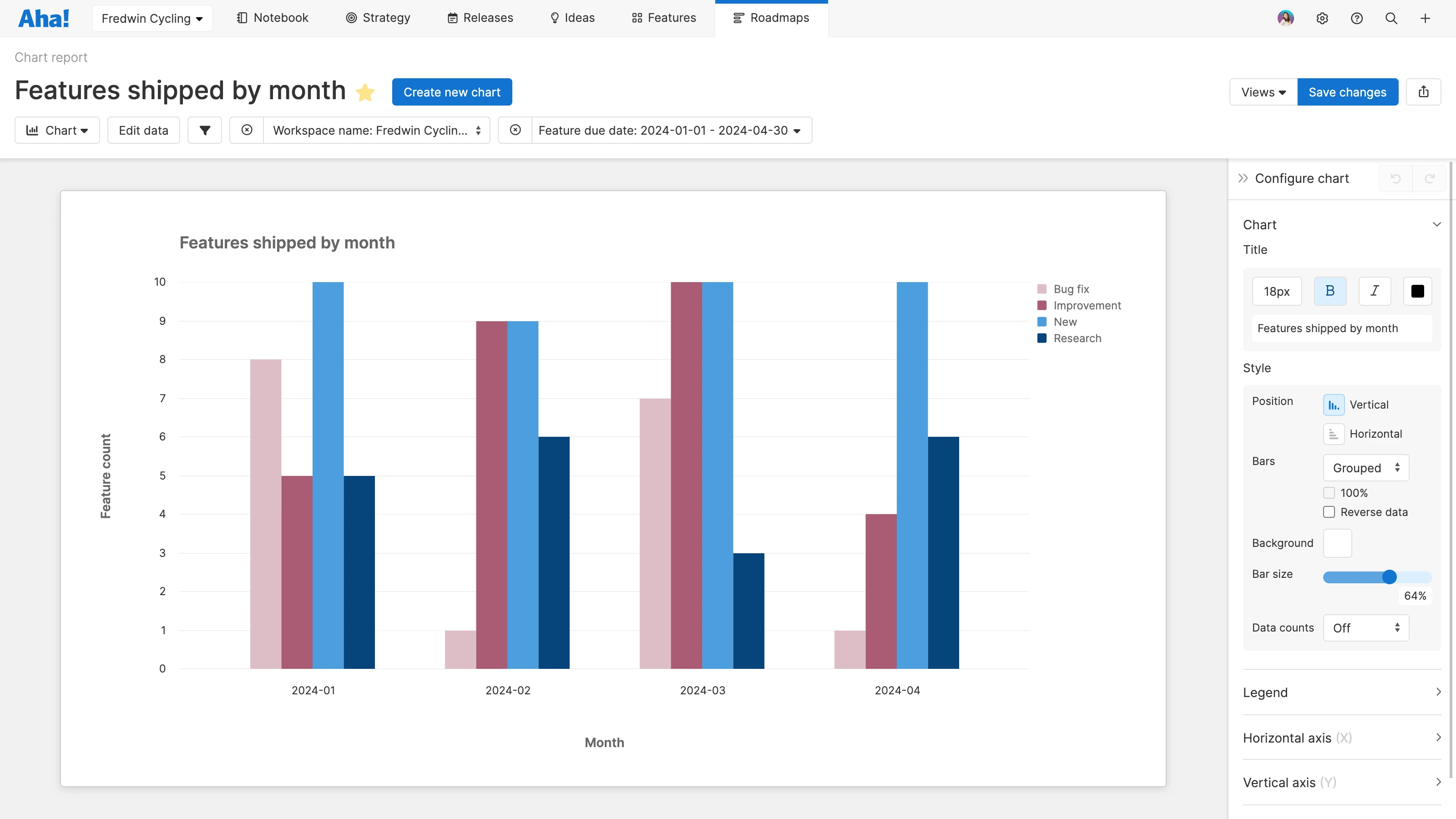
Turn your data into beautiful visualizations. Choose from a variety of charts — including bar, column, line, pie, scatter, and bubble options. Filter what you want to see and customize the details to create a powerful visual that tells a story. This helps you quickly spot trends, outliers, and opportunities that might not otherwise be evident.
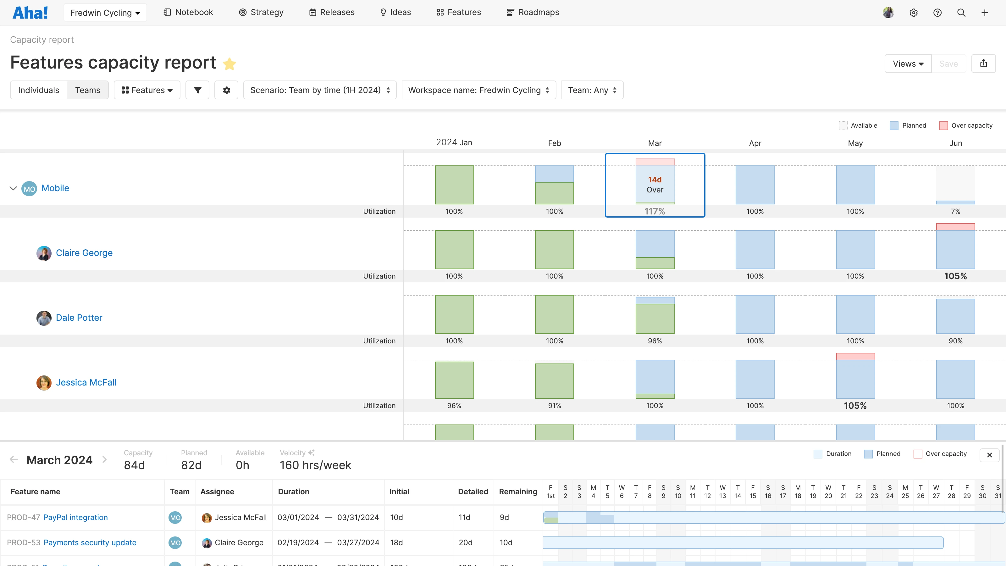
Make your strategic plans a reality. The capacity report helps you balance each person or team's workload with the timing of your plans. Quickly see who is under or over capacity and resolve any resourcing issues. Use the dependency report to view interrelated work across products — so you can keep your delivery plans on track.
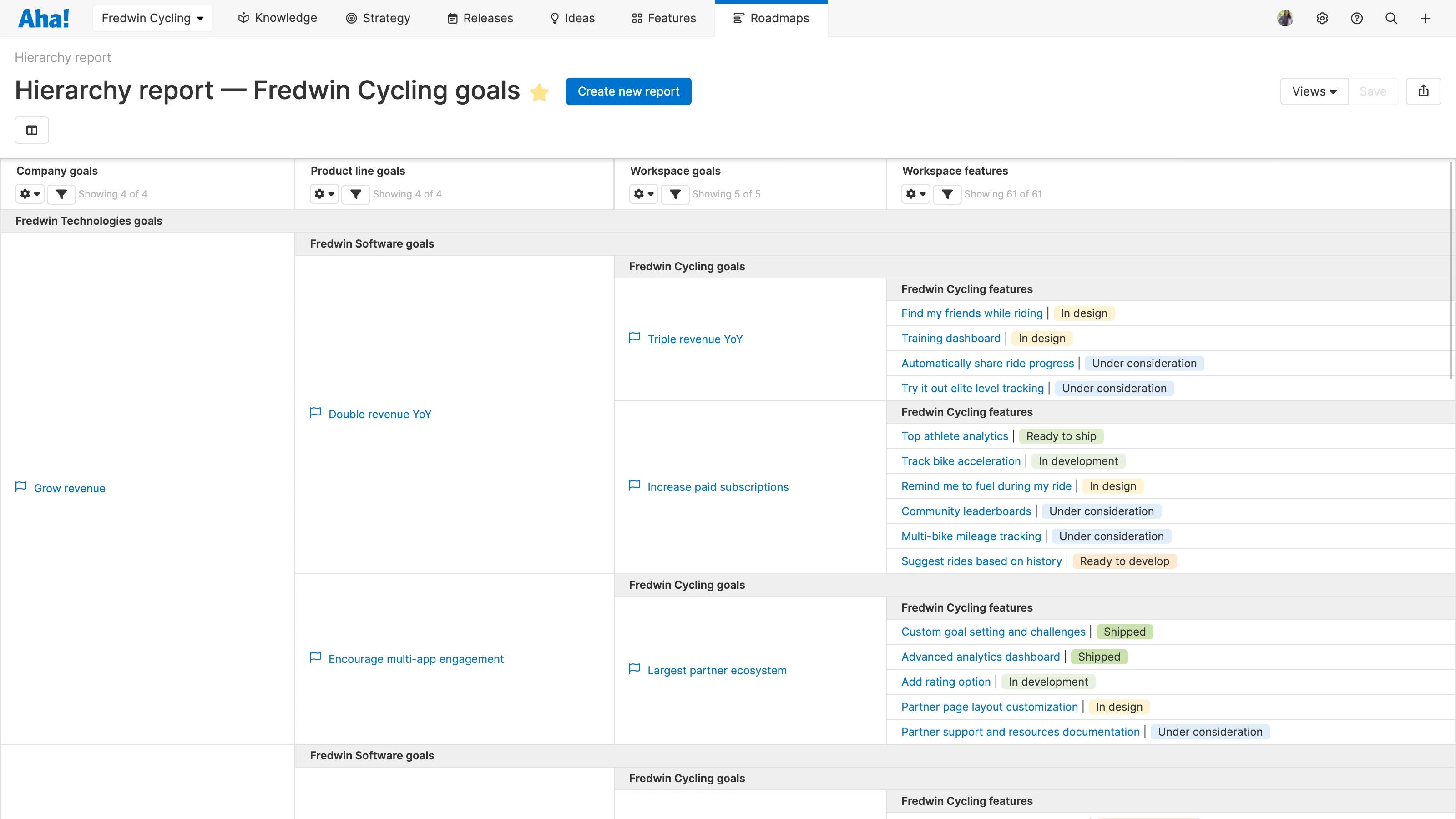
See how all of your product data ties together. Create a hierarchy report to visualize roll-up relationships between each level of your organization. The diagram report shows how your goals, initiatives, releases, and work items are connected — so you can see the business value that every effort delivers.