April 14, 2021 update to chart design
On April 14, 2021, we introduced a new experience for charts in Aha! Roadmaps and Aha! Ideas Advanced. The new experience includes improved aesthetics and more intuitive configuration controls.
Beginning on April 14, new charts created in your account will use the new design. You can switch back and forth between the styles until the new experience is permanently applied.
Click any of the following links to skip ahead:
What is changing?
The new chart design includes significant improvements.
Charts have a fresh new look.
Beautiful new style defaults have been designed with user accessibility in mind.
You can customize a chart's style from a single configuration panel with updates immediately reflected in the chart.
You can automatically sync your chart's Series color with the color of your Aha! Roadmaps or Aha! Ideas data so you can use consistent colors between your data and your chart.
We are removing one chart type, the 3D pie chart, that is not supported by the new design.
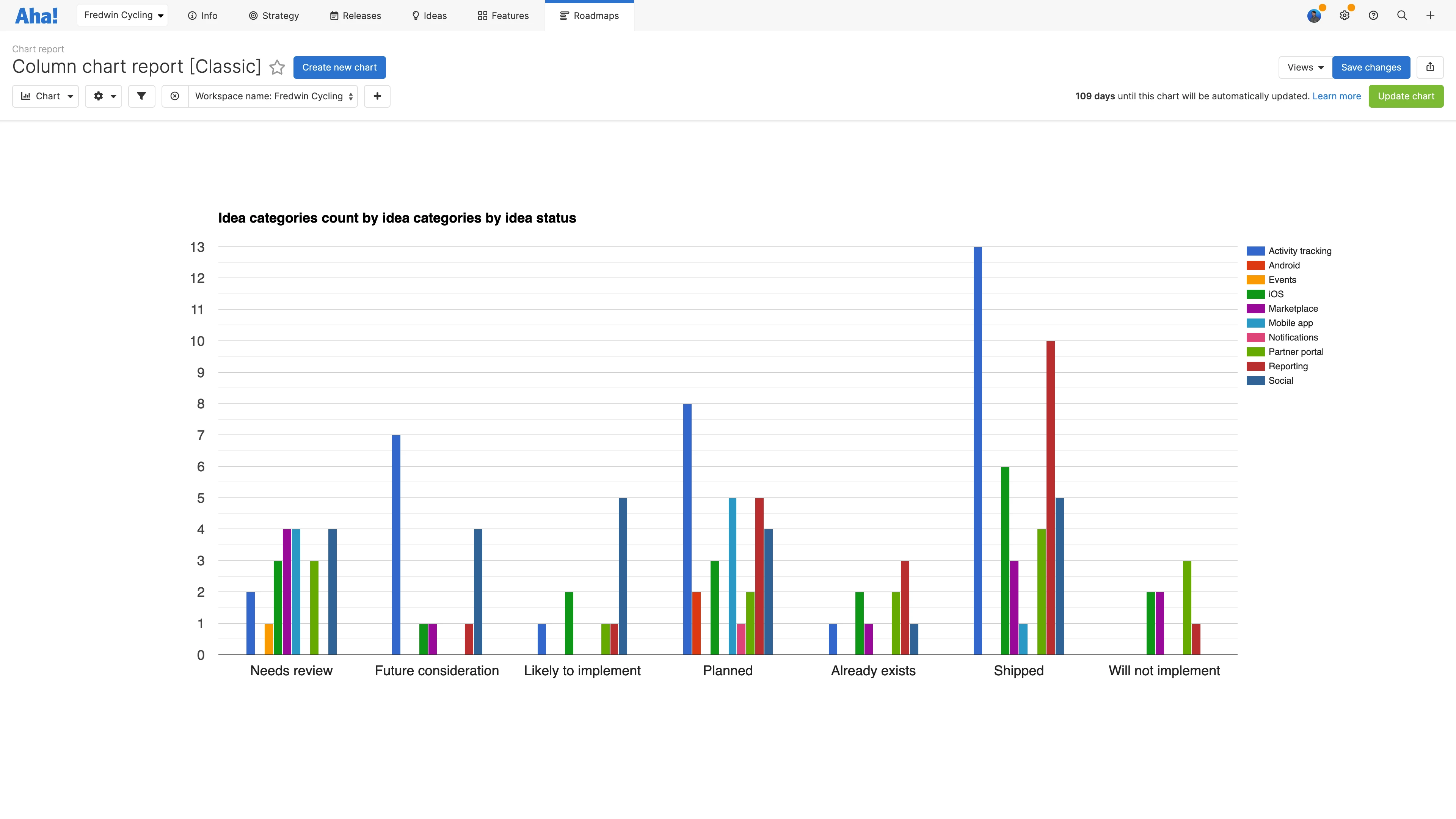
Here is a chart in the classic design:
Here is that same chart in the new design:
What is not changing?
This update affects the look of charts and the way you customize them. It does not affect how charts fundamentally work in your Aha! Roadmaps or Aha! Ideas account:
You can still build charts from scratch or select from one of many example charts.
You can still convert existing reports and roadmaps to charts.
You can still add charts to dashboards, notes, and Aha! presentations.
We are not adding any chart types.
Aside from the 3D pie chart, we are not removing any chart types.
Who is affected?
All Aha! Roadmaps and Aha! Ideas Advanced customers will see this update.
How do I access the new chart design?
Any new chart you create in your account will use the new chart design. If you want to get a feel for the new design and the improved configuration experience, navigate to Roadmaps Overview, select Example reports in the upper-left corner, and choose an example Chart.
How do I migrate my charts to the new design?
You can manually switch your saved charts to the new design before we permanently launch the new chart experience. Open any saved chart and click Update chart in the upper-right corner to migrate your chart to the new design. The migration will save your fields, filters, and all chart configurations except for color selections. You may want to sync with the colors used in your Aha! data with your data once you move to the new design.
If you want to compare the new and classic designs with one of your saved charts, you can click Update chart to move to the new view and Switch to classic chart to return to the classic view. Note: Your chart configuration will only migrate from classic to new view. So if you change your chart configuration in the new view and click Switch to classic chart, you will need to reapply your configuration choices.
When will support for the classic design end?
We are continually improving the new design, with plans to include most of the customization options available in classic charts. This includes label formatting, legend placement and pagination, custom background and border colors, and more. Support for classic charts will continue until all of these options are available. We will post an update once a date is set.
Note: Color selections in the classic chart design cannot be migrated to the new design. You can reselect those colors manually or choose to sync your Series' colors with your Aha! Roadmaps or Aha! Ideas data colors.
If you get stuck, please reach out to our Customer Success team. Our team is made up entirely of product experts and responds fast.