A simple guide to burndown charts for product teams
Last updated: May 2024
A burndown chart is commonly used for tracking agile development progress. It shows the amount of work completed against the amount of work remaining for the current sprint. Work is often measured in time, story points, or number of tasks.
In agile software development, teams commit to completing a batch of work each sprint based on their best estimates of time and effort. Burndown charts are the quickest and clearest way to visualize how the sprint is progressing and determine if the agreed-upon work will be completed on time. Some teams use a similar approach to track progress on releases and epics.
Build dynamic burndown charts in Aha! Develop — start a free trial.
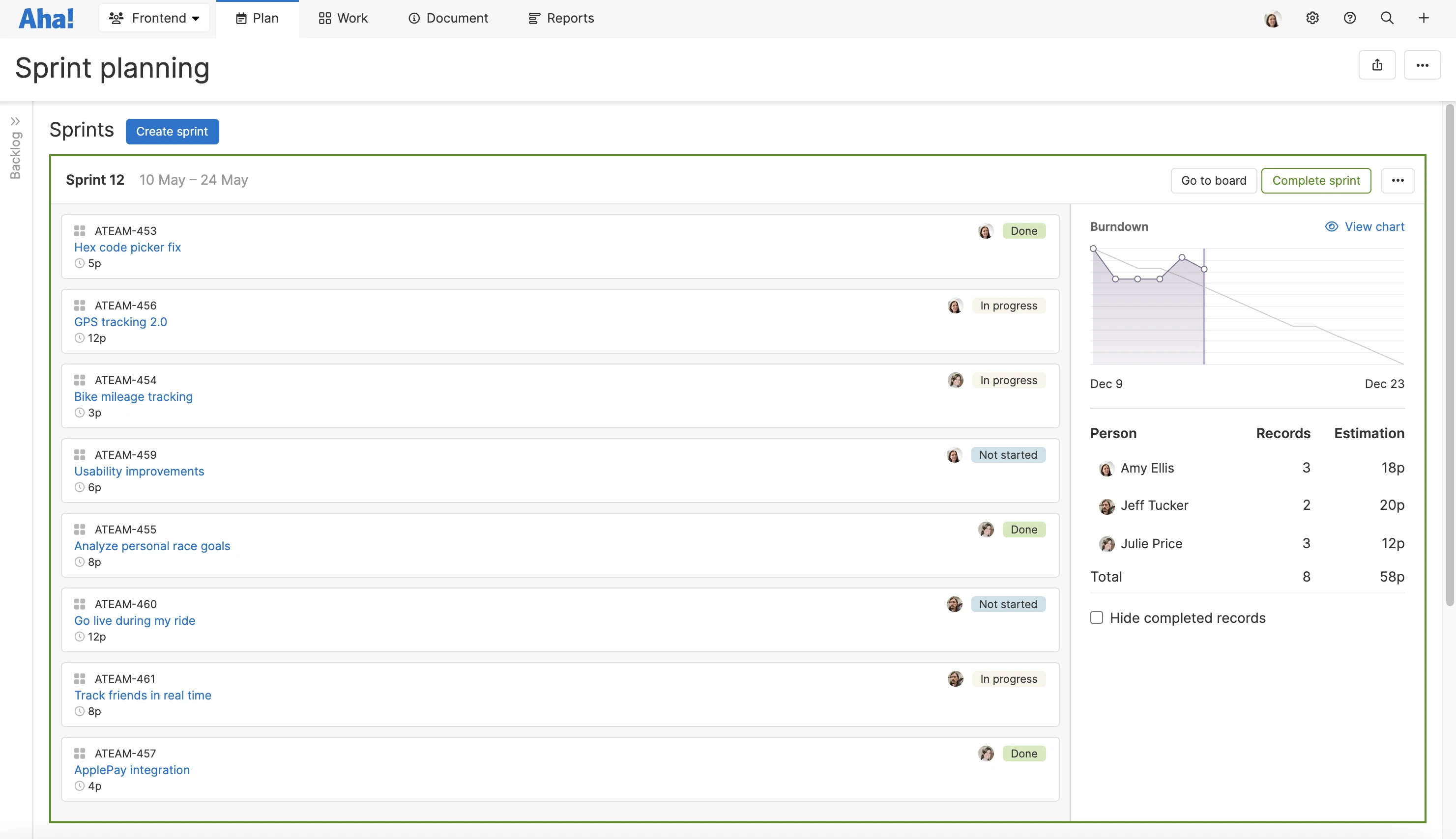
Burndown charts get their name from their appearance. Take a look at the example below. Most burndown charts have trend lines that represent your work progress over time. As your team "burns" through tasks, the amount of work remaining will decrease and the lines will trend downward.
An example of a sprint burndown chart created in Aha! Develop.
Your team may also use burnup charts, which are essentially the inverse of burndown charts. Both reports provide similar information. But instead of measuring remaining work, burnup charts measure completed work so the progress lines trend upward. Burnup charts are helpful for forecasting and communicating project scope. Burndown charts are more commonly used by development teams concerned with delivering work on time.
What are the components of a burndown chart?
Here is what you will find on a typical burndown chart:
Horizontal axis: Your timeline — informed by the start and end date of your work period. This may display in days, weeks, or months depending on your team's cadence.
Vertical axis: Your progress measurement. Most teams measure work in time, story points, or by the number of items to complete.
Estimates: In a burndown chart, your estimates determine where the trend lines start on the vertical axis. For example, if you estimated that this week's sprint will require 50 story points of work, then the trend lines will start at 50 on the chart.
Ideal pace: Your ideal burndown line is a linear progression based on your timeline and work estimates. It represents the best-case-scenario rate of progress.
Actual pace: Your actual line on the burndown chart is a linear progression based on your timeline and work estimates. It is based on actual work items being completed and is updated as you move along the timeline.
Work completed: Some interactive burndown charts can highlight details of the work items that have been completed.
A burndown chart highlighting the work items completed so far. Example from Aha! Develop.
Types of burndown charts
While burndown charts are most commonly used for agile sprints, you can use them to track almost any type of work. Here are a few different types of burndown charts:
Sprint burndown chart: Shows the sprint progress of your agile development team.
Release burndown: Gives a broader view of progress on all the product features and requirements that need to be completed for a product release.
Epic burndown: Provides an even longer-range view of progress on work that may span multiple releases.
How to build a burndown chart
You can build burndown charts in a few simple steps:
Find a burndown chart tool: You can build your own simple burndown chart in a spreadsheet. If you use an agile development tool, it likely has built-in burndown chart functionality.
Decide on your progress measurement: Most teams measure work in time, story points, or record count. Whichever you choose it should match the metric you use for your estimates.
Decide on your timeline: In most cases your timeline should match your sprint duration (e.g. two to four weeks) or release timeline.
Enter your estimates: Your estimate will set your ideal pace line. This is a key input for setting up your burndown chart.
Update the chart: As work is completed, update the burndown chart to see your actual pace start to move along the timeline. This step could be manual or dynamic depending on the tool you use.
Track your results: Check in on your burndown chart throughout your timeline to monitor how work is progressing.
How to read a burndown chart
Once your sprint is underway, you can start analyzing your progress. Reading a burndown chart is simple. Your actual burndown line will fluctuate up and down (and sometimes above and below the ideal pace line) throughout the work period. Here is how to interpret those fluctuations:
If your actual pace is above the ideal pace: Your work is behind schedule. This means there is more work than you may have time to complete based on your estimates.
If your actual pace is below the ideal pace: Your work is ahead of schedule. This means you have completed more work more quickly than you estimated.
If your actual pace matches or is below the ideal pace at the end of the work period: You have achieved your goal.
Benefits of burndown charts
A burndown chart can help agile teams monitor velocity — the amount of work they can typically complete within each sprint. The chart gives a realistic view of velocity by highlighting how much is actually getting done during the sprint and how quickly it is being completed.
With this insight, you can determine the likelihood of achieving your sprint or release goal — and you may even be able to influence the outcome. If your burndown chart shows that your pace is slower than anticipated, you can try to identify where things are lagging, resolve roadblocks, and get back on track.
Many agile teams consult burndown charts as part of daily standups. They can be a great conversation-starters and motivational tools. But keep in mind that the scope of your sprint should not change once it has begun. A burndown chart can help you see if this commitment is honored.
You can also revisit your burndown charts in an agile retrospective to inform the next sprint. If the burndown charts show that your team is consistently finishing sprints early, you might not be committing to enough work. The reverse is also true.
Burndown charts are ultimately beneficial and popular for the streamlined view of progress that they provide. That is why most agile teams keep one handy.
Limitations of burndown charts
With those insights come a few caveats. A burndown chart only offers one high-level view of progress. While it can show where your velocity is slowing down, it cannot tell you why your progress has stalled. It also does not give details on the priority or value of remaining work items.
Burndown charts are also only as good as your estimates. If your predictions are way off, you will not learn much by looking at a burndown chart. For instance, if a user story is estimated at five hours but actually requires eight, your burndown chart might suggest (misleadingly) that your team is falling behind. But the problem is not your team's pace — the inaccurate estimate is the culprit.
Try building your own burndown chart for your next sprint to see if your actual pace lands you at your goal. Achieving everything you committed to at the start of the sprint is a great feeling. But of course this does not always happen. If your burndown chart indicates that you have come up short, dig into the results with your team. Use your burndown chart to iterate on your sprint planning process and improve for the next one.