Pivot tables
Pivot tables are incredibly powerful tools for in-depth analysis of your data. Just like list reports, pivots allow you to summarize vast amounts of data and visualize it in a way that immediately communicates its value. Use pivots to track idea trends across customer segments, workflow bottlenecks, the status of strategically important work, or any other use case that comes to mind.
Click any of the following links to skip ahead:
Create a pivot table
Before you create a pivot table, it is helpful to think about how the Aha! report model works. Reports are built around the relationships between your record types. The order in which you add related record types to your report matters. As you work through the report builder, try experimenting with different record types and see how it affects the report you create.
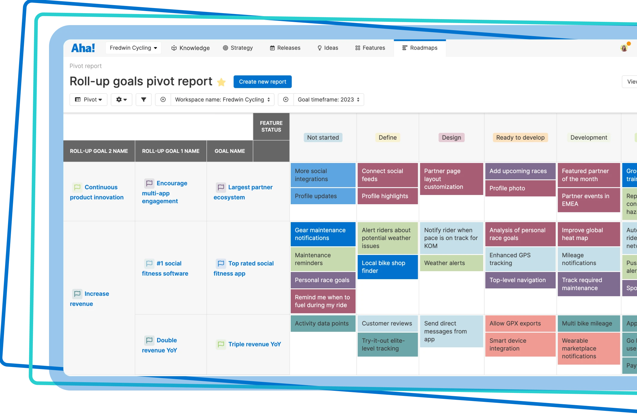
To create a new pivot table:
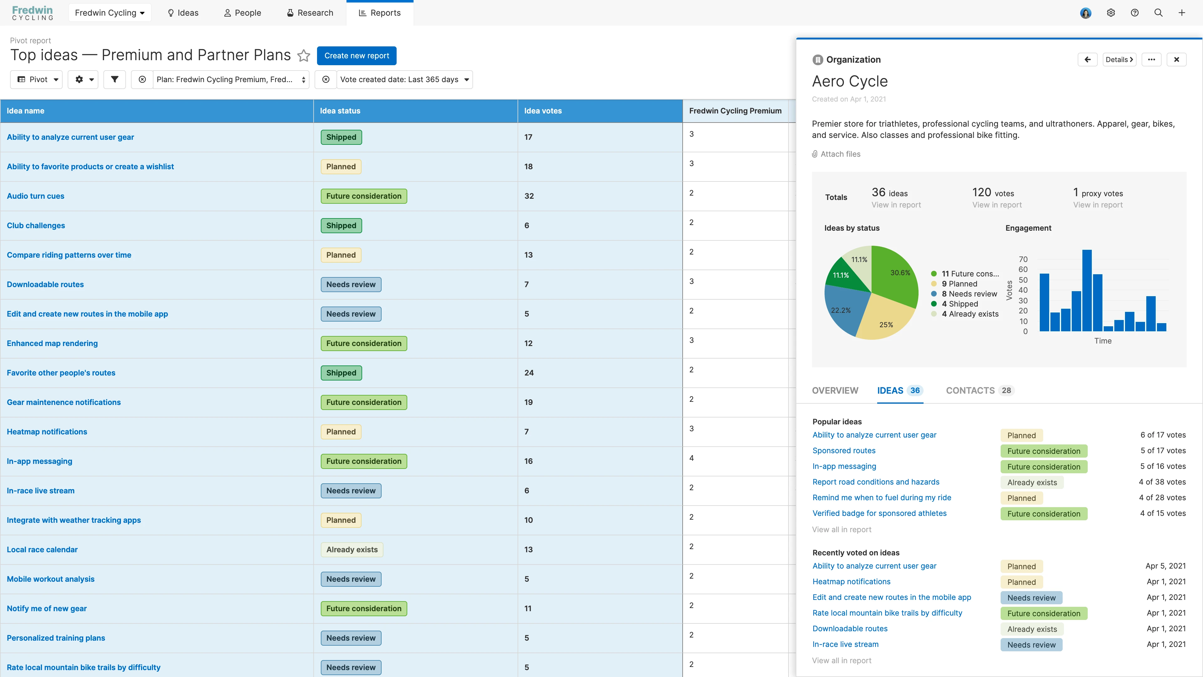
For Aha! Ideas (and Aha! Develop accounts integrated with Aha! Roadmaps), navigate to Reports Pivot.
For Aha! Roadmaps, navigate to Roadmaps Pivot.
Click the Create new report button. This will open the report builder, which will walk you through the process.
If you are new to pivot tables (or would like some inspiration), choose to Use an example pivot report. Select one of the options and watch your pivot table build itself. You can always customize the example report after you have created it to fit your needs.
Otherwise, select Create your own pivot report, then follow the next step in the report builder to Select records for your pivot table. You can select from Popular, Advanced, or (for Enterprise+ customers) Custom tables.
Click Next to progress through the report builder to the next step.
Add fields
In the Add fields step, you will add fields based on the record type(s) you select to the rows, columns, and cells of your pivot.
When you select a record type, your Aha! account will automatically create a column that includes the record's name. This ensures that you are putting together a table with valid data objects that can be pivoted against each other.
Remember, the first record type you select will define the relationship for future data added to your table. For more details on how this works, please read more on how the Aha! report model works.
Use the Record hierarchy to adjust the record types that your pivot will be built on. Then click Add fields in your pivots Columns, Rows, or Cells to add fields from those record types to your pivot table.
Quantify report rollups through calculations across rows and down columns with the Within cells list as: option. Functions include list, count, sum average, minimum, and maximum. The list of available functions will vary based on the data you select for the table.
Sort by row, column, or cell values in the report by clicking the Sort fields buttons. You can sort every value in the pivot table by any other field available — including fields you are not displaying in the report. Drag and drop when multiple values are present to choose which sort should supersede the others.
Note: Custom table relationship fields, available to Enterprise+ customers, are not sortable.
Click Next when you are ready to move on to the Add filters step of the report builder.
Add filters
Add filters as necessary by clicking the Add filter step in the report builder. You can also do this by clicking the Add filter + icon on the filters bar to add a quick basic filter after you have created your pivot table. Filters are organized by record type and are searchable to allow you to find specific details without scrolling through long lists.
Once you have selected a filter, you can filter your report by blank (or not blank) values, by specific or a range of values, or by using advanced filters to apply logical strings to your filters. If you know exactly how you want to focus your report, set your filter values right from the report builder. And later on, you can always use inline filters to refine your reports too.
When you are done, click Create report to create your pivot table.
Customize the report
Once created, you can customize your new pivot table with the Customize view dropdown.
The Edit data option will take you to the Add fields step of the report builder. The Customize style option will open a modal to help you customize the theme, formatting, and color layout of your pivot.
Theme: The different themes change the visual layout of the table and enable different sets of colors to be used when colorizing data on the table.
Show row headers + Show column headers: Toggles the display of optional headings for your columns or rows. The headings will display what the data type is in the column or row fields of your pivot table.
Show cell headers: This shows cell headers and enables calculations — total, average, minimum, maximum, count — within individual cells on rows and columns.
Use swimlanes for first row headers: This option will place the heading for the first data object in Rows as the header across the top of the data. This is useful if the table is too long and you wish to make it easier to read. You can also just move the column to the Column target.
Allow table cells to wrap: This wraps text to help limit the width of cells when displaying large amounts of information, such as the full descriptions of features.
Color by: This allows you to select which data objects to color based on the data available in your table. You can then customize the colors based on the color palette available for your theme. Assigned colors for some fields (like initiative name, goal name, and workflow status) will default to selected colors assigned during their set up.
You can also use your cursor to customize the column width of your pivot table by clicking on the border between columns and dragging the width.
Chart your data
If you use Aha! Ideas or Aha! Roadmaps (or an Aha! Develop account that has been integrated with Aha! Roadmaps), you can convert your pivot table to a chart. Once you have created your pivot, click the Change view type dropdown and select Chart.
If your pivot table can convert directly to a chart, you will see a beautiful visualization. If you need to provide a little more direction, click Edit data, then organize your fields into the chart type that best suits your needs.
Save pivot views
To save the view, click the Views button on the top-right corner of the page and select Save view. When you save a view, you will have the option to name the saved view, choose who you wish to share your saved view with, and select if others can edit the view. Saved views are then accessible within the Views menu under the Saved views section.
Share your pivot table
With your pivot table completed, you can easily share it with your stakeholders by selecting one of the export options under the Share button on the top-right of the screen.
All Aha! products
To invite people outside of your Aha! account to view your report, select Share as webpage.
To export your report for further analysis, select Export to Excel or Export to CSV. You can import from CSV to update data later. The Export to Excel option is particularly powerful as it allows Aha! Roadmaps users to export the entire pivot table in Excel without losing any of the table formatting. This is perfect for when you need to combine information from multiple systems or use an advanced formula.
For a static version of your report, select Save as image or Save as PDF.
Aha! Roadmaps and Aha! Ideas
To schedule recurring email delivery of your report, select Schedule email delivery.
Aha! Roadmaps only
To include your report in a presentation, select Add to presentation. In your presentation, you can select the report's update frequency.
To add your pivot table to a dashboard, select Add to dashboard. Dashboards combine several Aha! views into one page to tell a complete story about your plans and progress.
Export a pivot table to a whiteboard
Explore your structured data in a more fluid way. Export a pivot table to a whiteboard to visually explore different scenarios by moving records around.
From your pivot table, click Export and select Add to whiteboard as records. The Add to whiteboard modal will open. Select Existing whiteboard and select a whiteboard from the dropdown to add the records to a whiteboard that already exists in your workspace or personal documents. Select Create new whiteboard and select a workspace to open the records in a new whiteboard (you can select None to open the new whiteboard in your personal documents.) Then click Add to whiteboard.
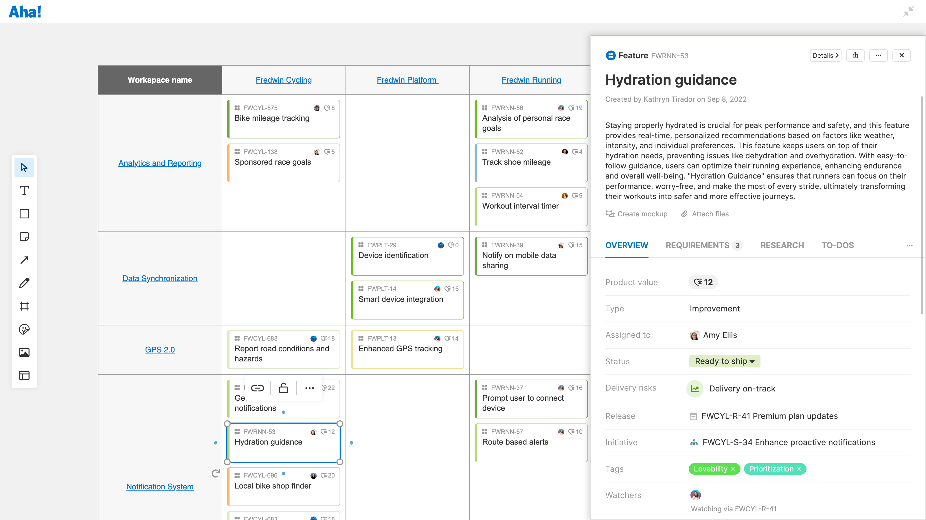
When you export a pivot table to a whiteboard, records included in the report will populate within a whiteboard table. Click a record to open its detail drawer. Other elements of your pivot table will populate as text or shapes. You can customize the table by adding new columns and rows, moving records into different cells, and changing colors and table formatting.