Charts
If the right picture is worth a thousand words, the right chart is worth a hundred meetings. A chart can distill your ambitious goals into one image, show your development velocity at a glance, or highlight a feedback trend that your audience might otherwise have missed.
But there is an art to chart configuration. Configured incorrectly, your chart might be too disorganized to be effective, with confusing labels, mismatched colors, and a format that does not tell the story you intend.
Your Aha! account includes a wide variety of highly customizable charts so you can always find the right vehicle for your data's story. And since you work in your Aha! account already — creating strategic plans, analyzing customer feedback, or designing a fully extendable development environment, your charts will automatically update as your data does. You can also convert existing list reports and pivot tables to charts — no need to reselect your fields and filters. And for Aha! Roadmaps users, add charts to dashboards, notes, and Aha! presentations, where they can become an integral and beautiful part of your narrative.
In this article, we will preview each of the chart types you can create, list the different ways to customize each one, and detail how to save and share your chart with your audience.
Click any of the following links to skip ahead:
Create a chart
There are three ways to create a chart.
First, you can always start with an example chart. Your Aha! account comes with many prebuilt reports and charts to choose from.
For Aha! Roadmaps, navigate to Roadmaps Chart
For Aha! Ideas and Aha! Develop, navigate to Reports Chart
Click Create new chart, then select Use example chart.
Second, you can build a chart from scratch.
For Aha! Roadmaps, navigate to Roadmaps Chart
For Aha! Ideas and Aha! Develop, navigate to Reports Chart
Click Create new chart, then select Create your own chart.
Finally, you can convert list reports, pivot tables, and, for Aha! Roadmaps users, custom roadmaps, to charts using the Change report type dropdown in the top-left corner of the report or roadmap's page. This starts your chart building process off with record types already selected, so you can build a report with the same record relationships that you used for your report or roadmap.
However you choose to build a chart, the report builder will walk you through the process.
In the Select records step, select the primary record you want to use to build your chart, then optionally link an additional record type from the suggestions. For example, you might want a chart built from both ideas and idea votes.
In the Add fields step, you can add more record types and their fields to your chart configuration. Remember, your Aha! account's reports are built on the relationships between record types, and the order you add related record types to your chart matters. As you work through the report builder, try experimenting with different record types and see how it affects the chart you create. All data displayed in the chart will be in relation to the primary record selected. Also in this step, select the chart type you wish to create.
The last step in the report builder is to Add filters to your report. You can add Basic filters here for a simple series of dropdown filters at the top of your report. Or you can add Advanced filters if you want the filters to have a relationship with each other, and make use of the logical operators All, Any, and None. If you know exactly how you want to focus your report, you can set your filter values right from the report builder. And later on, you can always use inline filters to refine your reports too.
Click Create report to create your chart. You can come back to the report builder anytime. Click the Edit data or Edit filters icons to return to the relevant step.
Column charts
There are three types of column charts available to you.
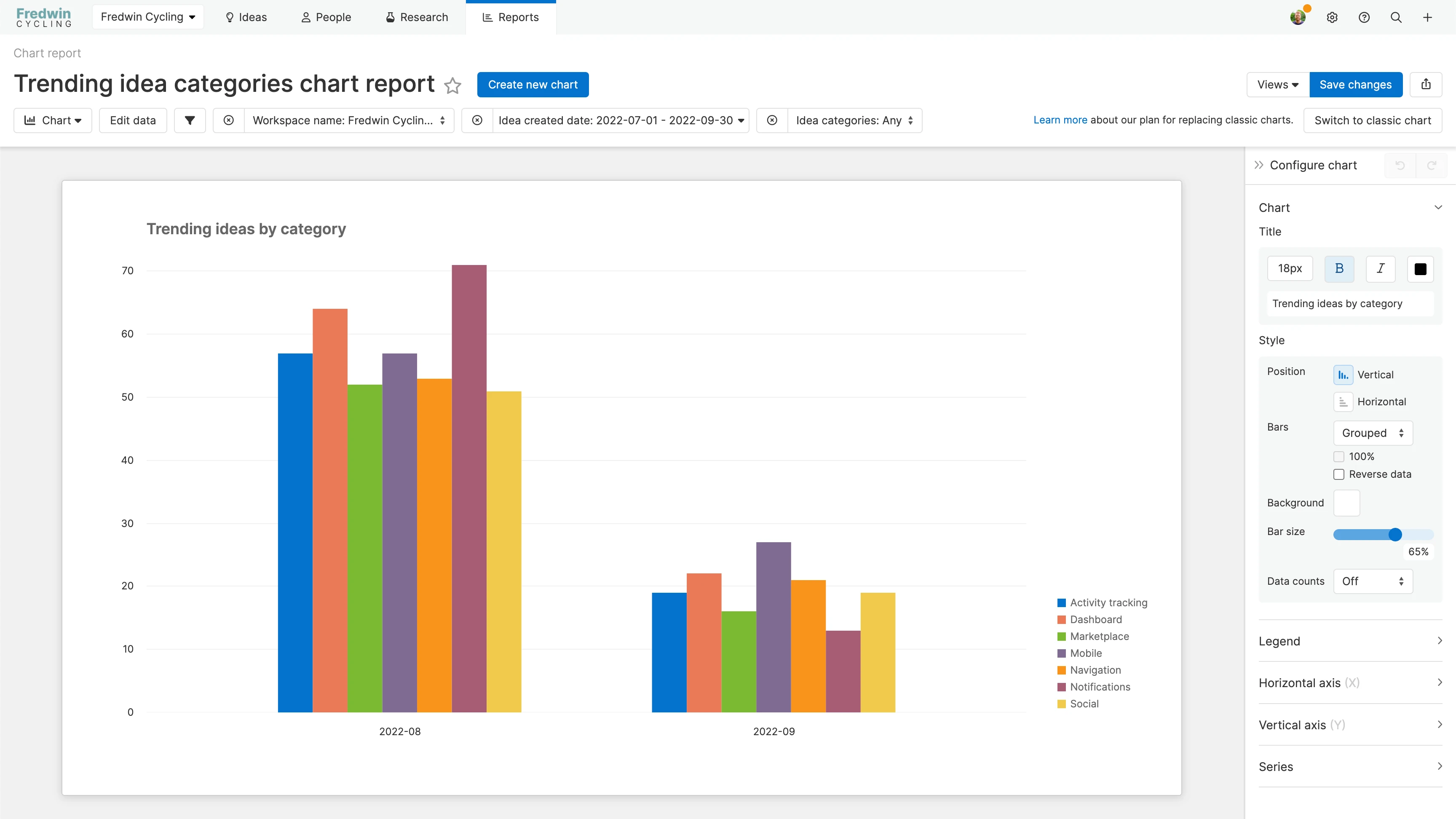
Column charts visualize your data in columns vertically along an X- and Y-axis. You can select how to calculate the height of the columns along the Y-axis, assign fields to the axes, and assign an optional series field.
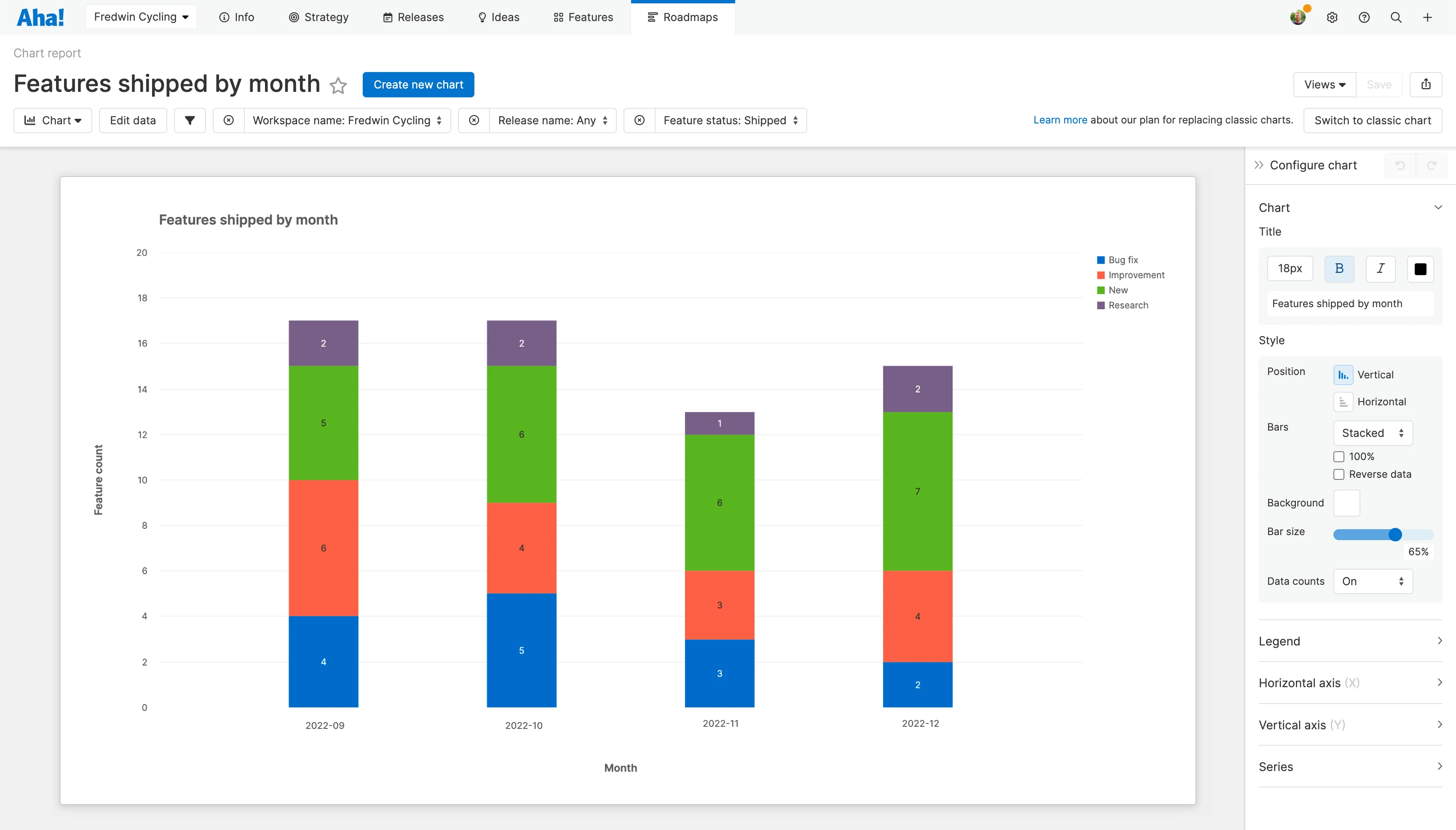
Stacked column charts visualize your data in columns along an X- and Y-axis, and break down each column into parts determined by an optional Series. You can select how to calculate the height of the columns along the Y-axis, assign fields to the axes, and assign a series field.
100% stacked column charts visualize your data in columns along an X- and Y-axis, showing you a percentage breakdown of the columns' parts, determined by an optional Series. You can select how to calculate the height of the columns along the Y-axis, assign fields to the axes, and assign a series field.
When you customize a column chart, you have a few settings to choose from.
In the Chart section:
Adjust the default Title of your chart.
Select the Position of the bars, either Horizontal or Vertical. Note: This setting effectively converts column charts to bar charts and vice versa.
Select whether the bars should be Grouped (side by side) or Stacked (on top of each other). If you choose Stacked, you can also choose whether the bars should fill part of 100% of the chart.
Select where your chart's Legend should appear if you want to include one.
Enable or disable Data counts. If you enable Data counts, your chart will include labels for each data point in the chart.
In the Horizontal axis section:
Choose whether to enable the vertical (Y) axis.
Give the axis an optional Title.
Adjust the Slant of the axis Labels.
Add a Prefix or a Suffix to the axis Labels. Anything you add here will appear directly in front of or directly after each label. Click the Refresh icon to undo your changes.
Add boundaries to your data. For example, if you notice that your trendline is getting cut off at its apex, increase the Max of the vertical axis to make more room. Click the Refresh icon to undo your changes.
In the Vertical axis section:
Choose whether to enable the horizontal (X) axis.
Give the axis an optional Title.
Adjust the Slant of the axis Labels.
In the Series section:
Choose whether you want the series colors to sync with data color. If you have selected custom colors for a data element (custom status colors, for example, or a custom color for each initiative), the chart can use the same colors so that your data appears consistently everywhere.
For each data element in the series, you can also select a different custom color by clicking on the color button. Click the Refresh icon to undo your changes.
Bar charts
There are three types of bar charts available to you.
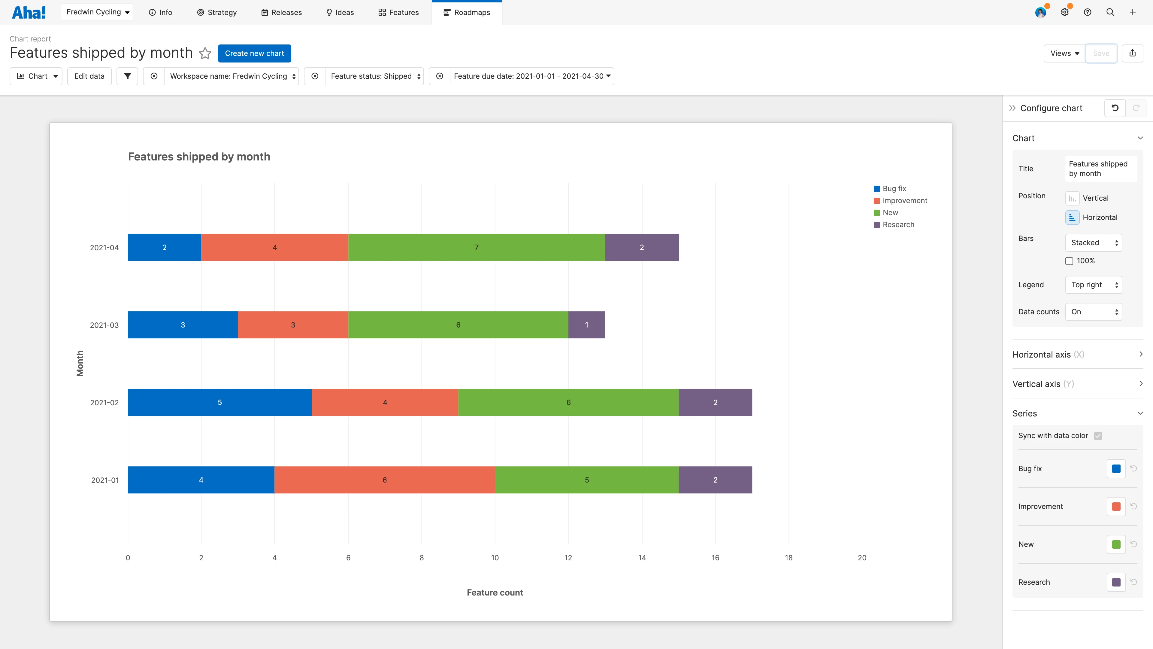
Bar charts visualize your data in columns horizontally along an X- and Y-axis. You can select how to calculate the length of the columns along the X-axis, assign fields to the axes, and assign an optional series field.
Stacked bar charts visualize your data in columns along an X- and Y-axis and break down each column into parts determined by an optional Series. You can select how to calculate the length of the columns along the X-axis, assign fields to the axes, and assign a series field.
100% stacked bar charts visualize your data in columns along an X- and Y-axis, showing you a percentage breakdown of the columns' parts determined by an optional Series. You can select how to calculate the length of the columns along the X-axis, assign fields to the axes, and assign a series field.
When you customize a bar chart, you have a few settings to choose from.
In the Chart section:
Adjust the default Title of your chart.
Select the Position of the bars, either Horizontal or Vertical.
This setting effectively converts column charts to bar charts and vice versa.
Select whether the bars should be Grouped (side by side) or Stacked (on top of each other). If you choose Stacked, you can also choose whether the bars should fill part of 100% of the chart.
Select where your chart's Legend should appear if you want to include one.
Enable or disable Data counts. If you enable Data counts, your chart will include labels for each data point in the chart.
If your chart contains so much data that the bars are less than 15 pixels in height, the data count will not be displayed. But you can see the data count by hovering over the bar.
In the Horizontal axis section:
Choose whether to enable the horizontal (X) axis.
Give the axis an optional Title.
Adjust the Slant of the axis Labels.
In the Vertical axis section:
Choose whether to enable the vertical (Y) axis.
Give the axis an optional Title.
Adjust the Slant of the axis Labels.
Add a Prefix or a Suffix to the axis Labels. Anything you add here will appear directly in front of or directly after each label. Click the Refresh icon to undo your changes.
Add boundaries to your data. For example, if you notice that your trendline is getting cut off at its apex, increase the Max of the vertical axis to make more room. Click the Refresh icon to undo your changes.
In the Series section:
Choose whether you want the series colors to sync with data color. If you have selected custom colors for a data element (custom status colors, for example, or a custom color for each initiative), the chart can use the same colors so that your data appears consistently everywhere.
For each data element in the series, you can also select a different custom color by clicking on the color button. Click the Refresh icon to undo your changes.
Line charts
There are two types of line charts available to you. When you hover over a data point, the line chart will display a tooltip with your data's value at that point and a vertical dotted line to the point you are referencing.
Line charts display data trends over time by plotting lines through a series of data points across an X- and Y-axis. You can select how to calculate the height of the data points along the Y-axis, assign fields to the axes, and assign an optional series field.
Smooth line charts display data trends over time by plotting lines through a series of data points across an X- and Y-axis but smooth the line(s) to give a better visual sense of the trend. You can select how to calculate the height of the data points along the Y-axis, assign fields to the axes, and assign an optional series field.
When you customize a line chart, you have a few settings to choose from.
In the Chart section:
Adjust the default Title of your chart.
Select whether the Trendline for your chart should be Linear or Smooth.
Select where your chart's Legend should appear if you want to include one.
Enable or disable Data counts. If you enable Data counts, your chart will include labels for each data point in the chart.
Choose whether or not your chart should Plot null values.
In the Horizontal axis section:
Choose whether to enable the horizontal (X) axis.
Give the axis an optional Title.
Adjust the Slant of the axis Labels.
In the Vertical axis section:
Choose whether to enable the vertical (Y) axis.
Give the axis an optional Title.
Adjust the Slant of the axis Labels.
Add a Prefix or a Suffix to the axis Labels. Anything you add here will appear directly in front of or directly after each label. Click the Refresh icon to undo your changes.
Add boundaries to your data. For example, if you notice that your trendline is getting cut off at its apex, increase the Max of the vertical axis to make more room. Click the Refresh icon to undo your changes.
In the Series section:
Choose whether you want the series colors to sync with data color. If you have selected custom colors for a data element (custom status colors, for example, or a custom color for each initiative), the chart can use the same colors so that your data appears consistently everywhere.
For each data element in the series, you can also select a different custom color by clicking on the color button. Click the Refresh icon to undo your changes.
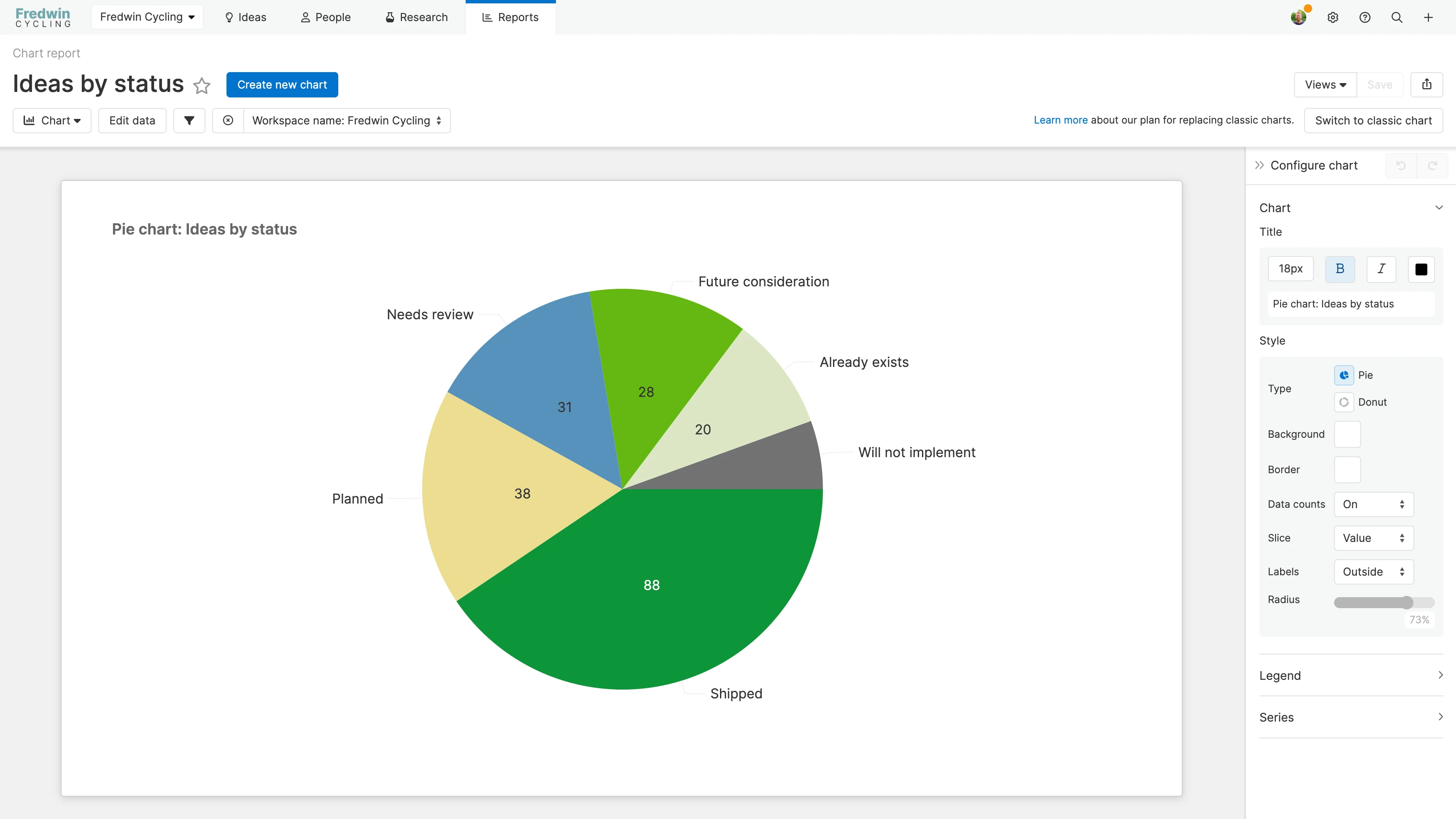
Pie charts
There are three types of pie charts available to you.
Pie charts divide your data into slices to show each slice's proportion relative to the whole. You can choose how to determine the size of the slices, and assign fields to the pie and to the slices.
Donut charts divide your data into slices to show each slice's proportion relative to the whole. They have a hole in the center to present a slightly different appearance than a pie chart. You can choose how to determine the size of the slices, and assign fields to the pie and to the slices.
3D pie charts divide your data into slices to show each slice's proportion relative to the whole and visualize the result in three dimensions. You can choose how to determine the size of the slices, and assign fields to the pie and to the slices.
3D pie charts will be deprecated with the charts design migration.
When you customize a pie chart, you have a few settings to choose from.
In the Chart section:
Adjust the default Title of your chart.
Select whether the Type of pie chart should be a Pie or a Donut.
Choose an optional Border color for your chart.
Select where your chart's Legend should appear if you want to include one.
Enable or disable Data counts. If you enable Data counts, your chart will include labels for each data point in the chart.
If you have enabled Data counts, select whether the pie chart's Slices should display the Values of the data or the Percentage of the pie.
Your selection here does not change the size of the slices, just the values they display.
Select whether the data's Labels should be Outside, Inside, or disabled altogether. If you select Inside, the Label text color will update automatically from black to white based on the color of the slices to preserve readability.
If you select Inside, then the Labels will replace your selection in the Slices setting.
In the Series section:
Choose whether you want the series colors to sync with data color. If you have selected custom colors for a data element (custom status colors, for example, or a custom color for each initiative), the chart can use the same colors so that your data appears consistently everywhere.
For each data element in the series, you can also select a different custom color by clicking on the color button. Click the Refresh icon to undo your changes.
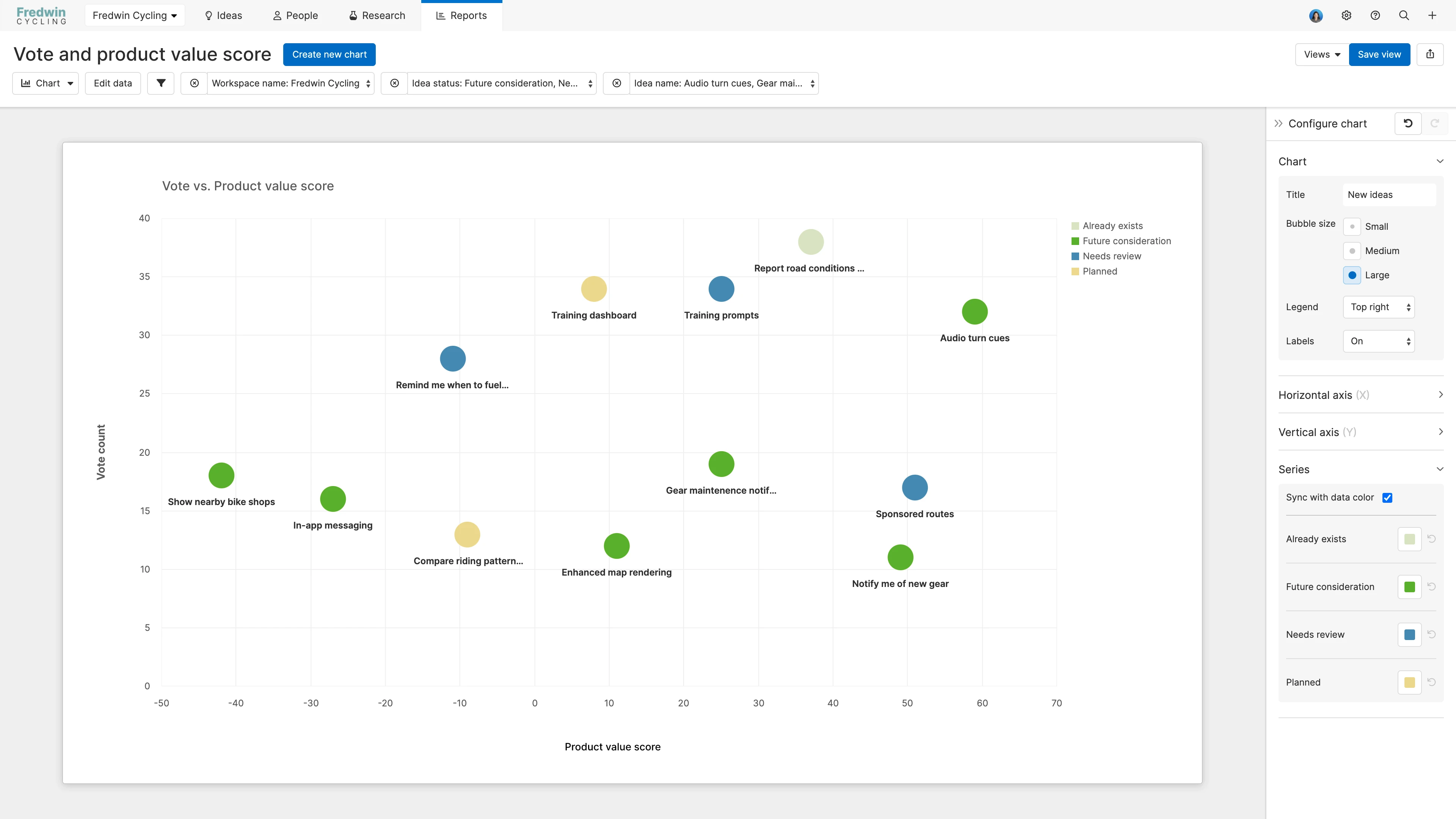
Other charts
There are two types of other charts available to you.
Scatter charts display a group of data points across an X- and Y-axis. You can assign fields to the X- and Y-axes, and assign a field to be the label that appears when you hover over a data point.
Bubble charts display a group of data points across an X- and Y-axis, with the ability to use a third dimension of data to affect the size of the bubbles. You can assign the field to be the label that appears when you hover over a bubble, assign fields to the X- and Y-axes, and assign an optional series field.
When you customize a scatter or bubble chart, you have a few settings to choose from.
In the Chart section:
Adjust the default Title of your chart.
Select the Bubble size, depending on whether you want a compact or expanded chart.
Select where your chart's Legend should appear if you want to include one.
Select whether to enable or disable Labels on your data.
In the Horizontal axis section:
Choose whether to enable the horizontal (X) axis.
Give the axis an optional Title.
Adjust the Slant of the axis Labels.
In the Vertical axis section:
Choose whether to enable the vertical (Y) axis.
Give the axis an optional Title.
Adjust the Slant of the axis Labels.
Add a Prefix or a Suffix to the axis Labels. Anything you add here will appear directly in front of or directly after each label. Click the Refresh icon to undo your changes.
Add boundaries to your data. For example, if you notice that your trendline is getting cut off at its apex, increase the Max of the vertical axis to make more room. Click the Refresh icon to undo your changes.
In the Series section:
Choose whether you want the series colors to sync with data color. If you have selected custom colors for a data element (custom status colors, for example, or a custom color for each initiative), the chart can use the same colors so that your data appears consistently everywhere.
For each data element in the series, you can also select a different custom color by clicking on the color button. Click the Refresh icon to undo your changes.
Customize your chart
Once you have created your chart, there are three ways to customize it further.
First, click Edit data to open the report builder and adjust the fields that you are using to create your chart.
Second, add or adjust filters on your chart. Hover over the filters bar and click the Add filters + icon to add basic filters quickly, or click the Edit filters icon to open the report builder to the Add filters step and add advanced filters.
Finally, use the Configure chart panel on the right side of your screen to customize your chart. Your customization options differ slightly depending on the chart you select, but you can see any changes you make reflected immediately in your chart.
Save your chart
To save your current view, click the Save view button in the top-right corner of the page. When you save a view, you will have the option to name it, choose who you wish to share your saved view with, and select if others can edit the view. The Views dropdown lets you access any view you have ever saved.
Share your chart
With your chart completed, you can share it with your stakeholders by selecting one of the export options under the Share button on the top-right corner of the page.
All Aha! products
To export your chart for further analysis, export it to Microsoft Excel or CSV file. You can import from CSV to update data later.
For a static version of your chart, export your chart to PNG image or PDF document.
To invite people outside of your Aha! account to view your charts, select Share as webpage.
Aha! Roadmaps and Aha! Ideas
To schedule recurring email delivery of your chart, select Schedule email delivery.
Aha! Roadmaps
Fold your chart into an Aha! presentation. To do this, select Add to presentation. In your presentation you can select the report's update frequency.
Add your chart to a dashboard. To do this, select Add to dashboard. Dashboards combine several Aha! Roadmaps views into one page to tell a complete story about your plans and progress.