About the Venn diagram template
You probably learned about Venn diagrams in grammar school — but that does not mean their only application is elementary. Venn diagrams can be a useful visualization tool to simplify complex ideas in product management. For example, you can use them to:
Align customer needs with business goals to prioritize product features
Compare product features with competitors to identify areas for differentiation
Represent similarities and differences between customer segments to better understand user needs
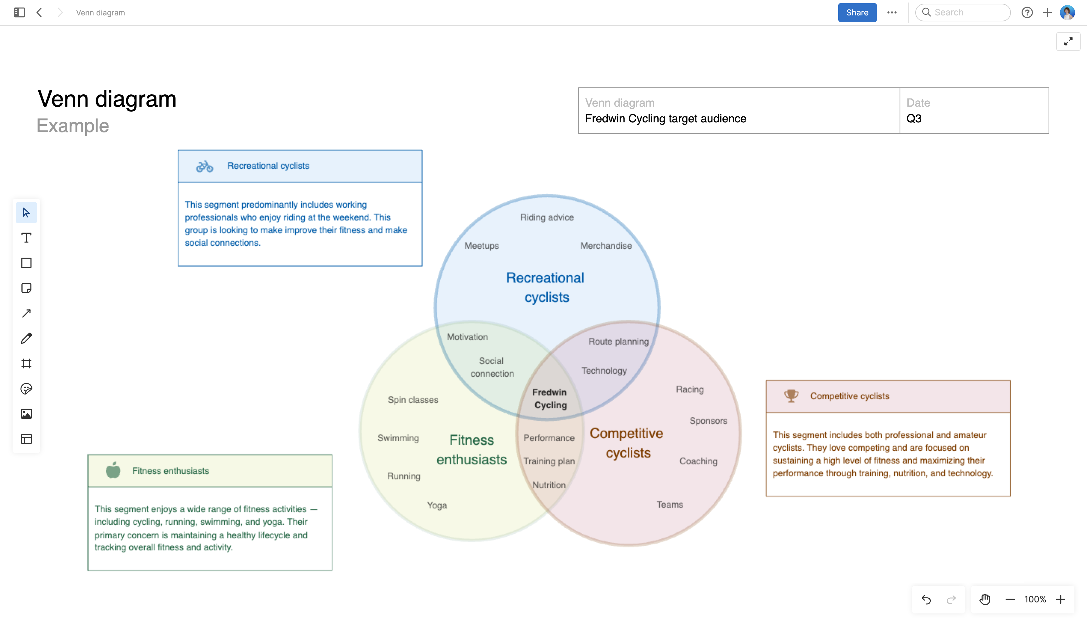
Our template has three overlapping circles to depict multi-way relationships. Of course, you can add or remove circles to meet the needs of your situation.
Best practices
Make data and concepts visually accessible so you can faciliate better discussions.
Clearly name data sets Label each circle in the Venn diagram to represent distinct sets or categories. This prevents confusion and ensures that stakeholders understand the context of the diagram.
Use overlapping areas intentionally Ensure that the overlaps represent meaningful intersections or relationships between the sets you are depicting. Avoid unnecessary or confusing overlaps.
Include a legend or key If your Venn diagram contains specific data or categories, include a key that explains the meaning of each circle and overlapping area. This helps viewers interpret the diagram accurately.
Keep it simple Venn diagrams are most effective when they are simple and uncluttered. Avoid overcomplicating them with too many sets or overlapping regions. If your data is complex, consider using other visualization methods like a decision tree or mind map.
