Just Launched! — A Fresh New Look for Aha!


Looks matter. I realize this might sound superficial. But we all know that aesthetics have a real impact on user experience. This is why our team at Aha! has been working on a fresh page look over the past few months. And we are excited to unveil it — a new header for the Aha! user interface (UI).
We set out to make Aha! easier for our 150,000 users to get work done. The new header is sleeker, fresher, and even more lovable than before.
The improved header UI makes important actions easier to access — no matter where you are in the application. We moved a few page elements and controls to unify the experience, but all of your favorite Aha! features are still there.
The new design provides:
Consistent page layouts and controls to help streamline work
Icon-based controls to help you quickly identify core actions
Updated color scheme to better highlight the core information on each page
Improved performance
Take a deeper look at the new Aha! header:
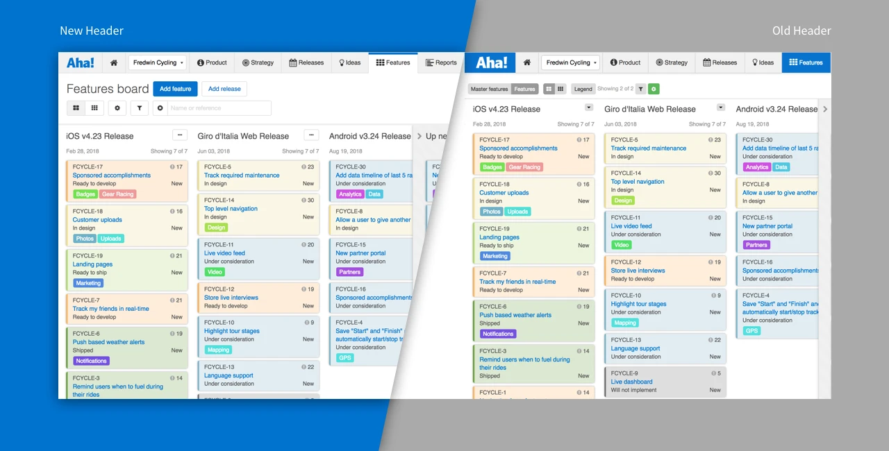
Simplified user experience The first thing we tackled was making the header layouts more uniform by reducing clutter and consolidating UI elements. This makes it easier to understand the main actions on each page. New team members will be able to get up to speed even faster — while Aha! power users will appreciate the streamlined experience and more focus on their product data.
Every page now has a prominent page header so you understand exactly where you are.
Consistent icon-based controls We also introduced icon-based controls to standardize the placement of core actions throughout the application. These make it clear where to go when you need to add data, apply filters, customize views, or adjust dates. Secondary actions are now grouped in the More options button — this can be found on the top right corner of the page, next to the Views dropdown.
More options buttons are now on the top right corner of releases, features, and requirements throughout the application.
Updated color scheme This change is easy on the eyes. We reduced the amount of color contrast in the UI to help you focus on the important stuff — your product details and primary actions on the page.
The new color scheme directs attention to the content and other key page elements.
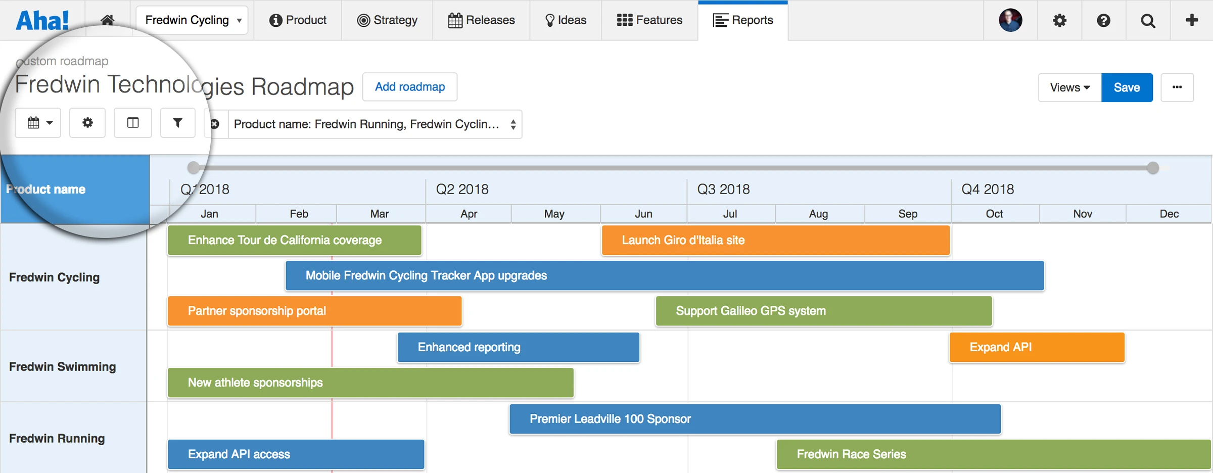
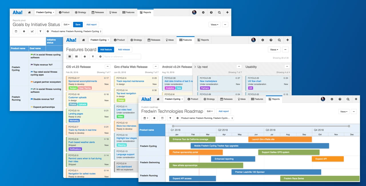
These changes introduce a new universal header design to deliver a familiar, consistent user experience throughout the application.
We spent a lot of time thinking about every detail of this improved header. And our support team has been hard at work updating the documentation to make your transition to the new UI as seamless as possible. Let us know what you think!
Sign up for a free Aha! trial — be happy The header redesign is live for all Aha! customers. If you are not already an Aha! customer, you may want to sign up for a free 30-day trial of Aha! now to see why over 150,000 users trust Aha! to set product strategy, create visual roadmaps, and prioritize releases and features.