
Design tokens: The building blocks of a design system
Implementing a design system at scale is often less about the pixels and more about the language we use to describe them. As a Senior Software Engineer at Aha! I've spent a lot of time thinking about how we can build a UI that is not only beautiful, but also deeply maintainable.
Our goal was consistency when we first started building out our component library. But as our product suite grew from Aha! Roadmaps to Aha! Develop and beyond, we realized that hard-coded hex values and one-off CSS variables weren't going to cut it. We needed a system that could evolve with us.
What are design tokens?
If you've ever waded through a legacy CSS file, you've likely seen "magic numbers" scattered everywhere — random hex codes like #F9FAFB or hard-coded padding like 14px.
To the reader, these values are meaningless and lack any inherent relationship to the design system or to one another. If the marketing team decides our primary brand blue needs to be slightly more vibrant, someone has to go on a "find and replace" hunt through the entire codebase, hoping they don't break a similar-looking shade of purple along the way.
Design tokens solve this by acting as the variables for your visual language. They become a shared surface where engineering and design communicate, and they are the smallest pieces of the design system that store visual design attributes.
In Atomic Design methodology, these are known as subatomic particles.
Think of it like an API for your UI. By naming the intent (e.g., color.background.secondary) rather than the value (#F7F7F7), we create a layer of abstraction that allows the design to evolve without the underlying code needing a total rewrite.
That's why we've been hard at work rearchitecting our design system around a tiered token structure. By moving toward the Design Tokens Community Group (DTCG) standard, we're creating a shared source of truth that bridges the gap between design and engineering.
Starting with the basics: Primitive tokens
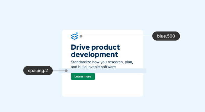
Every great system needs a foundation. For us, that foundation is primitive tokens. These are our raw building blocks — the "options" in our system. A color could be blue.500, a gap amount could be spacing.2. They represent the literal values of our brand palette, spacing scale, and typography.
Creating meaning with semantic tokens
All semantic tokens are built from primitive tokens. But whereas primitive tokens give us the values, semantic tokens give us the context. This is where the magic happens. A semantic token describes how a color should be used, rather than what it looks like. Instead of an engineer asking, "Should the background for this secondary area be gray.200 or gray.300?", they use a token likecolor.background.secondary.
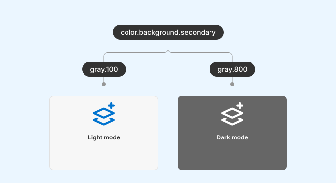
One benefit of semantic tokens is that they make theme switching a "solved problem." In light mode, for example, we might map the value of color.background.secondary to a light primitive gray.100. When the user enables dark mode, we could switch the value to a dark primitive gray.800. This way, the engineer doesn't have to write a media query — it's already set up in our design system.
Another benefit of semantic tokens is that color updates become trivial. For example, imagine a situation where both subtle borders and disabled text use the same gray.500 primitive token. If we needed to darken the disabled text one shade, we would have to manually hunt through all usages to determine which are borders and which are text. But with two independent semantic tokens (e.g., color.border.subtle and color.text.disabled) both mapping to gray.500, it's trivial to update the text color in one place.
Adhering to the DTCG standard
As we refined this structure, we looked toward the industry. The DTCG is working on a standard format for design tokens to ensure they can be shared across any tool, from Figma to Style Dictionary to our Rails and React codebase. Adopting this approach means we are moving away from bespoke naming conventions and toward a nested, predictable JSON structure.
In the example below, you can see how we define color.background.secondary with a value, type, and description:
{
  "color": {
    "background": {
      "secondary": {
        "$type": "color",
        "$value": "{gray.100}",
        "$description": "Used for secondary background areas like sidebars, headers, and subtle card fills."
      }
    }
  }
}
This alignment is key for us because it reduces the "translation tax" between design and engineering. When a designer updates a token in Figma, that change can flow through our pipeline and update the application with minimal manual intervention.
Why this matters for lovability
At Aha! we talk a lot about building lovable products. For an engineer, "lovability" extends to the code we interact with every day.
Before we made our changes, we were dealing with a hard-coded approach that was difficult to read and maintain:
.button {
  background-color: #f7f7f7;
  border: 1px solid ##e9e9e9;
  color: #333333;
}
Moving to named token primitives brought us some improvement, but didn't allow for dark and light modes or knowing what colors to choose:
.button {
  background-color: var(--gray-100);
  border: 1px solid var(--gray-300);
  color: var(--gray-900);
}
Now, however, we have semantically named tokens that can be made theme-dependent:
.button {
  background-color: var(--color-background-secondary);
  border: 1px solid var(--color-border-subtle);
  color: var(--color-text-primary);
}
A well-architected design system is a joy to work in. It allows us to ship features faster and reduces the risk of visual regressions.
Our token architecture can be thought of as the Rosetta Stone for our UI. It allows us to translate the same visual intent across different levels of abstraction. We're still on this journey, but the transition to semantic tokens and DTCG standards has already changed how we think about our UI. Engineering and design now speak the same language.
For more insights into how our engineering team helps build lovable products, read the Aha! engineering blog.


