Aha! Roadmaps | How to identify schedule risks with calculation columns
Your Aha! account is the single source of truth for your product strategy and roadmap progress — and reports in Aha! Roadmaps are so much more than a simple spreadsheet. Reports and roadmaps update as your team completes work, and you can click into any record you see to answer questions or update details.
To help you follow your curiosity, you can use calculation columns to analyze data in a report. Then visualize findings into views that help your team take action.
This article was inspired by a live tutorial we recorded. Head there to hear Reilly O'Connor and Rose Smith walk through these steps!
In this article, we are going to use calculation columns to evaluate a list of features and determine whether or not they need to be rescheduled based on the difference between the feature due date and release date. Follow along and give it a try!
Click any of the following links to skip ahead:
Confirm user permissions
Create a list report
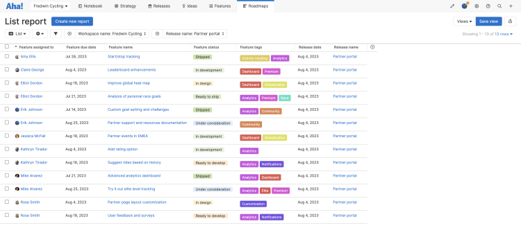
First, let's gather the information we need in a list report. The calculation columns we create will use the fields we add to the report.

To do this, navigate to Roadmaps List.
Click Create new report.
On the Select records step, we want to Create your own list report with Features Features with releases. Click Next to advance.
On the Add fields step, we will structure the list report.
For Feature, add the following fields: Feature name, Feature assigned to, Feature status, Feature tags, Feature due date.
For Release, add the following fields: Release name, Release date.
Click Next to advance.
On the Add filters step, we will focus the list report to just the relevant records.
Let's focus on features within a single release. Add a filter for Release name and select a release. We chose Partner portal.
Click Create report to create your report.
Want to filter your report further? You can add the same filter more than once. Add the filter to your report, then create an advanced filter subgroup and add it again — for example, to see all features that are tagged Analytics, but none tagged Premium plan.
Calculate the number of days between the feature due date and release date
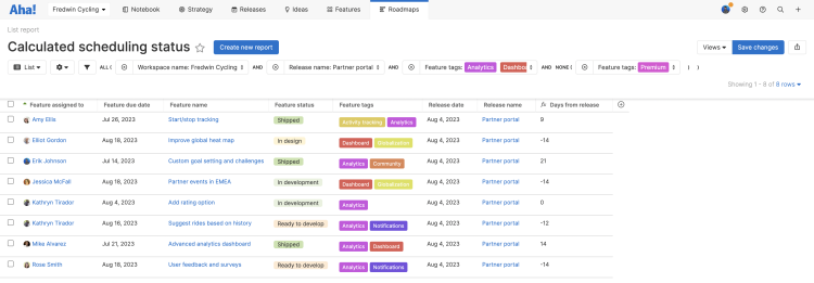
Time for a calculation column! First we will calculate the date difference between the feature due date and the release date. To do this, click the Plus (+) button at the rightmost column in the list report, and select Calculation column. This will open up the Equation builder.

In the Equation builder, you can see Fields from our report, Functions, and Operators. You can hover over any of these for a description, syntax, and examples, and click on them to add them to the equation.
Note: Feature tags is greyed out because that field type is not supported in calculation columns.
We are going to use the datediff equation. In this case, we are using the date on specific fields in order to calculate the date difference. But you can also calculate the number of days from today or for a specific date in the future or past. Thanks to our list report we have everything here we need already.
Click or type this equation into the Equation builder:
datediff(field("Feature due date"),field("Release date"),"day")If there was a problem with our equation, there would be a red box around it, with an error message. Our equation is error-free, so click Save to create the calculation column.
The calculation column works. Let's customize it to make it more useful.
The default name for the calculation column is Calculation 1. Click the column header to rename this to something more useful, like Days from release.
The values in the column show significant digits to one decimal place, but we will never be dealing with a fraction of a day. Click the More options menu at the top of the column, then Format column. Select No decimal, then click Save.
Flag at-risk features
This list of days between the individual feature's expected completion and the scheduled release date is already useful. But let's add a second calculation column to highlight the features that are not going to be ready in time — and should be rescheduled for a later release.

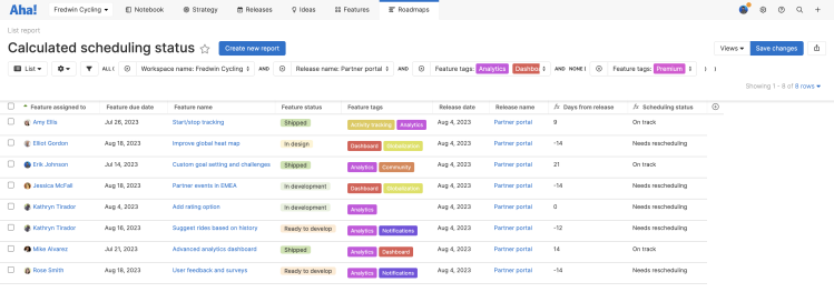
To do this, click the Plus (+) button at the rightmost column in the list report, and select Calculation column. This will open up the Equation builder — and note that our newly created calculation column Days from release is now an available Field.
An IF statement is the perfect function to use here.
Click or type this equation into the Equation builder:
if(field("Days from release")>0,"On track","Needs rescheduling").Click Save to create the calculation column.
The calculation column works. Let's customize it to make it more useful.
The default name for the calculation column is Calculation 2. Click the column header to rename this to something more useful, like Scheduling status.
Looking for more ways to flag at-risk work? Use automated and manual risk indicators to highlight and resolve delivery risks — before they affect your product plans.
Convert your report to other views
List reports are fantastic for line-by-line analysis. But if you want to summarize data, a pivot table works better. Let's convert our list report (and its calculation columns) to a pivot. Thanks to the Change view type dropdown, we do not have to create a new pivot from scratch. Instead:
From your list report, click the Change view type dropdown in the upper left of your report.
Select Pivot.
And just like that, we have a fantastic pivot table.

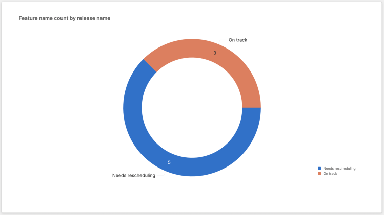
You can always customize this further — to do this, click ⚙️ Customize style at the top of the pivot — or continue to experiment with the Change view type dropdown. The Scheduling status calculation column would work very well in a doughnut chart, for example.
Set the Size to a Count of Feature name.
Set the Slice to the Scheduling status calculation column.
Click Save to create your chart.

Keep experimenting until you find the visualization that works best for your team — the chart that summarizes your release readiness at a glance, the list report that helps you dive into the details, or the pivot table that helps you contextualize your plans.
Want to see several of these views at once? Add reports, roadmaps, and Aha! views to a dashboard, so you have one page to track your team's progress.