
Just Launched! — Enhanced Pivot Table Reports
Here we go again. We just made reporting in Aha! a lot more powerful. You have a lot of data in Aha! and we want to make sure that you can visualize and report on it in the most compelling way.
So, we are taking our reporting capabilities a step further. Our latest update enhances your ability to create reports and visualize data in Aha! by allowing you to include cell headers and calculate sub-totals on pivot reports.
We added this capability because if you are going to create a complex table, it’s obvious that you need to know what data is in each column and row. You can use these new reports to make better planning decisions, track progress, and easily share updates across your team.
Here are several examples of how enhanced pivot reports can be used to deliver beautiful visual charts.
Highlight important data The addition of cell headers lets you easily choose and communicate what is important. Create robust pivot reports to give your audience a clear understanding of the data. For example, you can create a report that highlights your strategic goals and includes current status, success metrics, and timing for each goal.
Communicate strategic alignment You are often asked what the impact of your key product themes will be to the bottom line. Use pivot tables to show how your strategic initiatives will help achieve your goals, and analyze which initiatives to pursue based on the cost to develop and projected revenue.
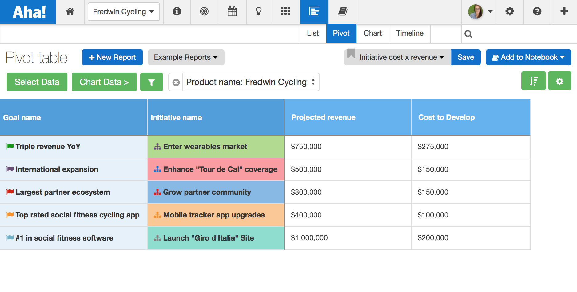
Strategically align your initiatives to goals, while reporting on cost to develop and projected revenue.
Make better planning decisions Added flexibility means you’re better informed and able to address issues before they impact the business. For example, leveraging a custom scorecard on releases that estimates the work required from each team allows you to identify areas where you may need to bring in additional resources or reprioritize features.
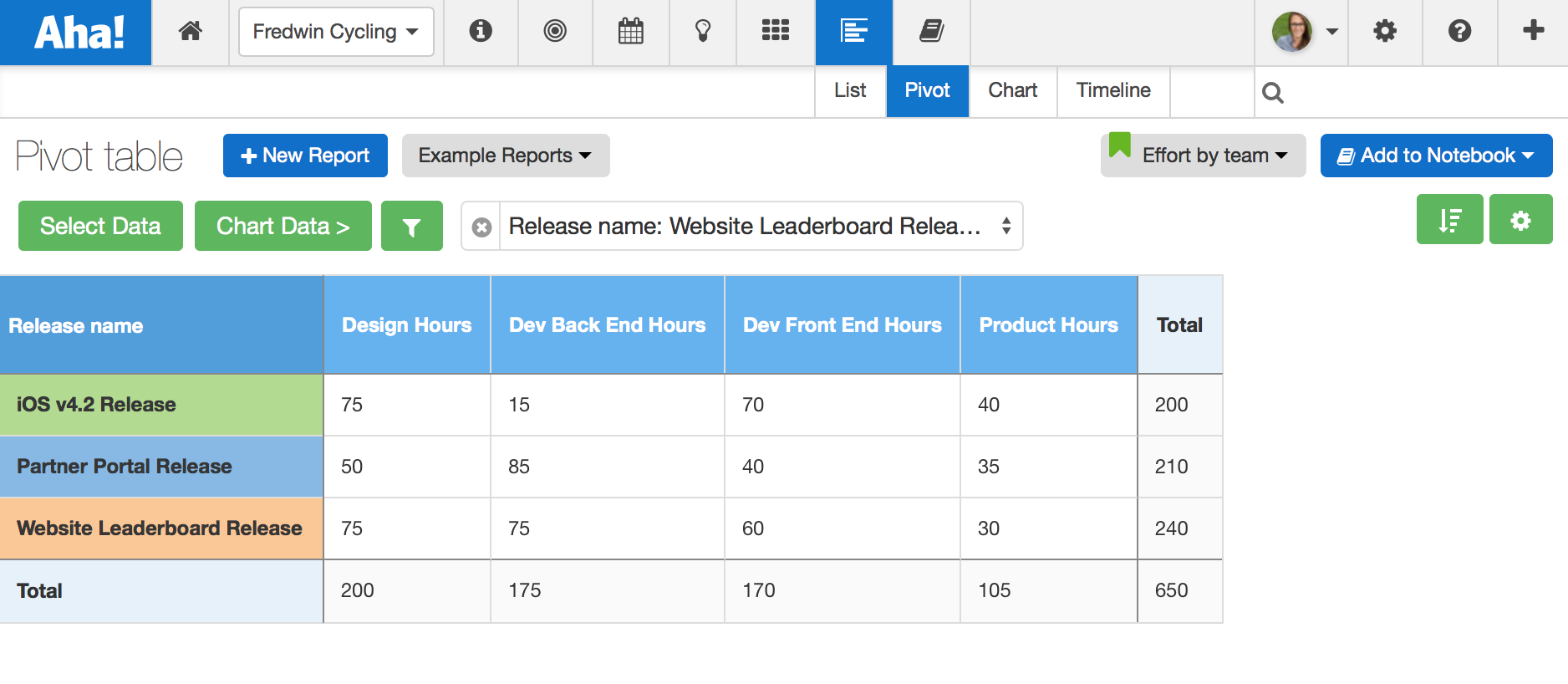
Create a custom scorecard at the release level to capture and report on team estimates.
Track team progress Keeping the team on track and everyone informed is crucial work for any product manager. Want to know how much work is left on a release? Now you can report the logged effort against the original estimate to see which releases are taking more time than expected.
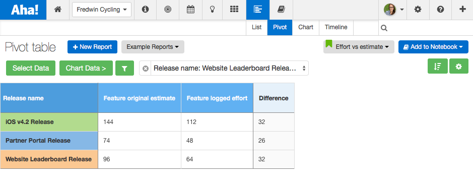
Compare logged effort against the original estimate to see remaining work in a release.
Easily share updates With the new cell headers, you can also visualize each field independently. For example, you could quickly turn the previous pivot report showing logged effort vs. original estimate into a beautiful chart by selecting the Chart data button. You can even customize the chart type and colors.
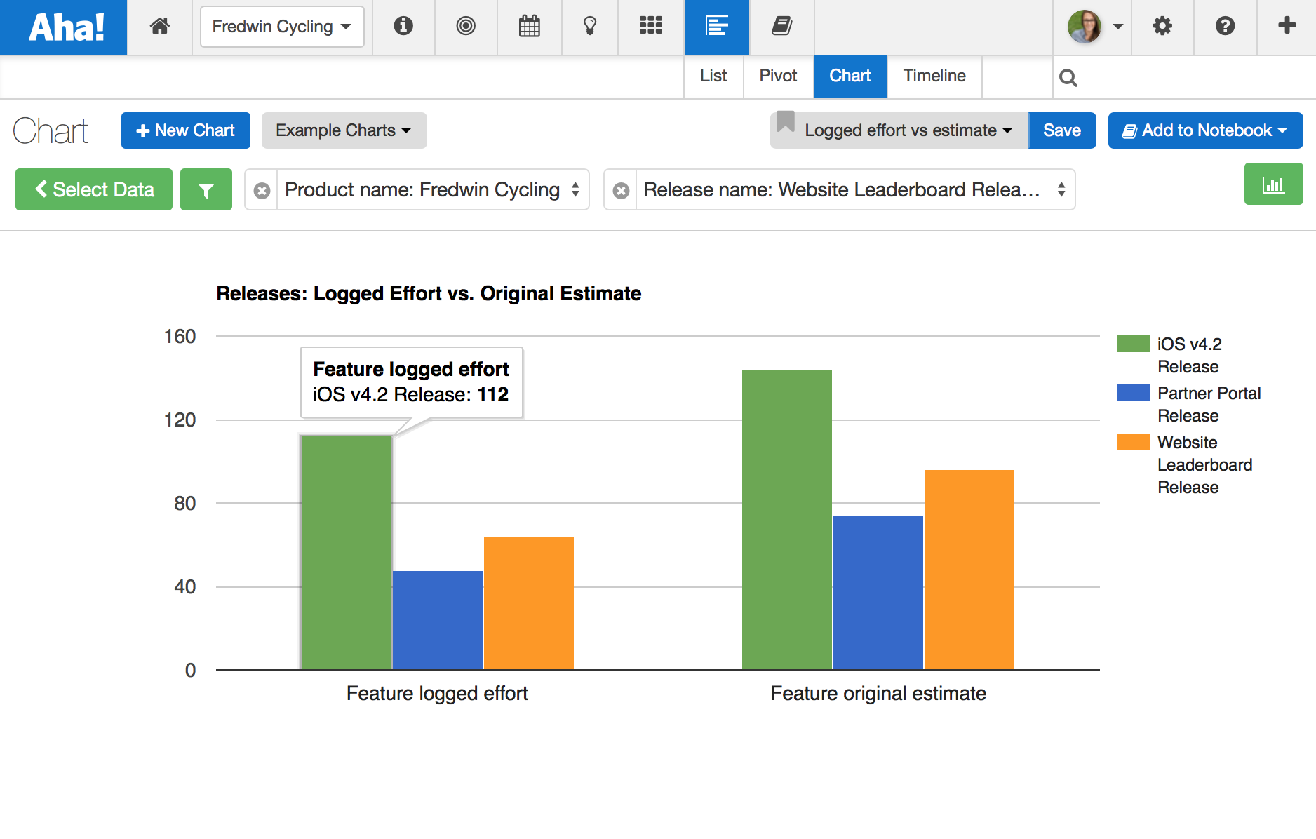
Easily turn your pivot report into a beautiful visualization.
Configuration This new functionality offers additional flexibility when creating reports and enhances capabilities on existing Aha! reports. As a reminder, it only takes a few minutes to build beautiful custom pivot reports. Here is how:
Create a pivot report under Reports Pivot Select Data
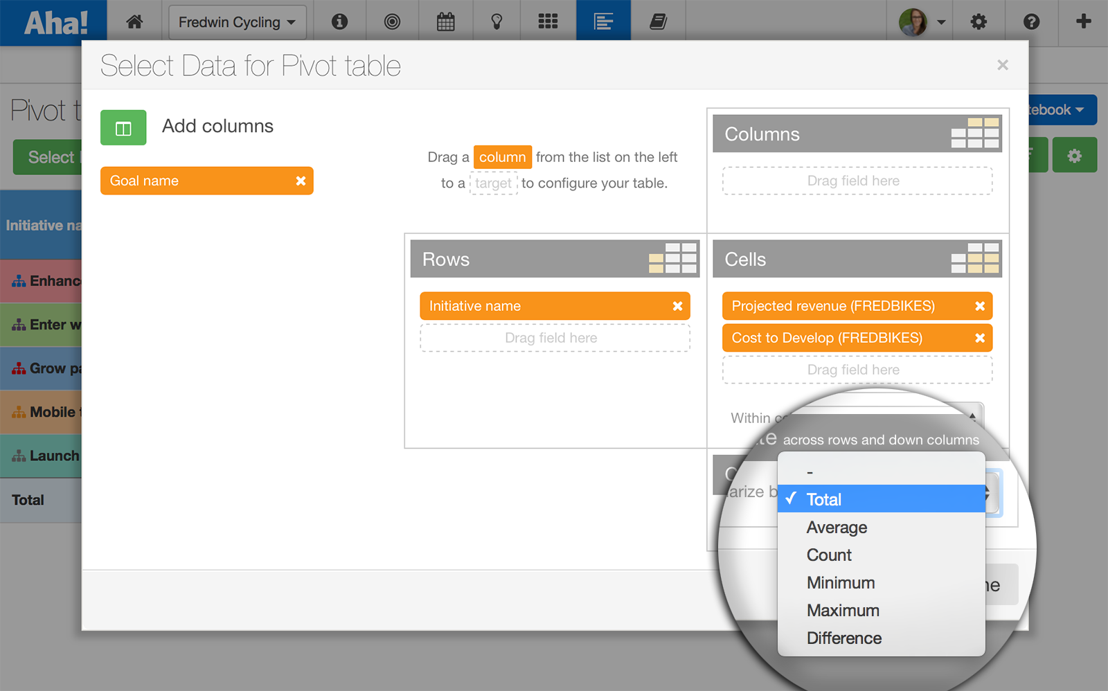
Make a selection in the Cells section to determine what data should appear within cells. Rows will appear on the left and Columns at the top of your report.
The Calculate section will appear, allowing you to make calculations based on totals, averages, counts, minimum, maximum and difference. Create calculations across rows and down columns.
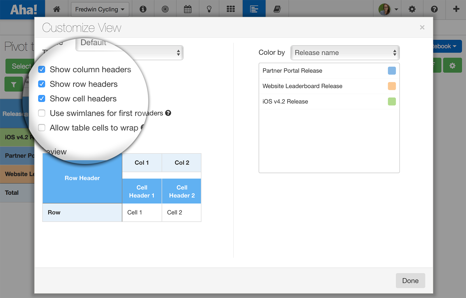
Select the Customize View button on the pivot table page to choose whether cell headers will be shown. Once selected, the headers will be displayed immediately on your pivot table, including automatic sums and totals.
With Aha! you can visualize everything about your product and your team in a single place. And with enhanced pivot reports, your data just became even more powerful!
Signup for a free Aha! trial — be happy Enhanced pivot table reports are available to all Aha! customers. If you are not already an Aha! customer, you may want to sign up for a free 30 day trial of Aha! now to see why over 50,000 users trust Aha! to set product strategy, create visual roadmaps, and prioritize releases and features.
